
Discussing various iterations of Superman’s iconic emblem throughout his almost ninety-year history: From its instant global recognition as a symbol for truth, justice, and one of the world’s most renowned superheroes, this logo has undergone numerous modifications over time. However, it’s important to note that we won’t be considering alternate versions like those from “Kingdom Come” or any minor changes in flashback arcs. We’ll focus on the mainline Clark Kent/Superman and significant alterations to his emblem in the current timeline. Today, we’re going to explore and rank them all while setting some ground rules to ensure a focused discussion.
13) Stylized S, Red Outline
In the early stages of Superman’s career, when his appearance was still evolving and he was mainly a newspaper strip character, most alterations to his logo took place. The iconic symbol debuted in Superman #14, marking the first time it had a red border. Although I appreciate the addition of this element, I’ve never been fond of the ‘S’ shape in this particular design. It appears too pointed and compressed within the triangular shield, giving an overall squished look. This logo serves as a bridge between the earliest shield designs and the more familiar classic versions, but it clearly demonstrates the struggles during this transition period. While significant in terms of Superman’s history, this logo doesn’t stand out as effectively on its own.
12) Godfall Logo
In the “Godfall” comic book series, a unique version of the Superman logo, characterized by its red and silver color scheme, was prominently displayed. This storyline revolved around Superman, who had lost his memory, living in Kandor’s Bottle City with a fictional wife named Lyla. This particular logo design persisted until Superman recovered his memories. Despite being different from other versions, it certainly made an impact due to its reversed color scheme – the traditional red parts were now silver, and the negative space was filled with red. It’s an eye-catching image that complements perfectly the regal atmosphere of the Kryptonian world where Superman awoke.
11) First Black Symbol
As a devoted fan, I can’t help but express my admiration for this unique take on Superman’s logo. For the first time, his iconic shield embraced black, a bold deviation from its traditional yellow form. The black was cleverly incorporated into the negative space, adding depth and complexity to the design. Although short-lived, appearing only in Superman #4, this logo paved the way for future classics. It was particularly influential in inspiring the timeless Fleischer Superman cartoons that won the hearts of many.
10) Recovery Suit
As a devoted cinephile, I found myself enthralled by Superman’s transformation post the dramatic “Death of Superman” incident. Clad in an all-black suit, he sought to absorb maximum sunlight for his rejuvenation, preparing himself to confront fraudulent figures like Cyborg Superman. The emblem adorning this attire shares the same distinctive shape and style as the iconic Superman insignia, yet it has been meticulously colored silver. One might assume that such a bright hue would be overpowering or obscure details, but against the dark suit, it surprisingly complements rather than clashes. This emblem embodies pure, minimalist elegance, conveying so much with just a single color and the solid foundation of its form. It’s no wonder that this design has always been cherished by fans, especially during those instances when Clark dons his chic black suit.
9) Electric Blue/Red

Although they are distinct symbols due to their colors, it’s more practical and accurate to discuss them together. Despite some valid criticisms about this costume, these symbols are quite intriguing. To complement Superman’s new energy-based abilities, the classic ‘S’ emblem was modernized to resemble a bolt of lightning. The blue symbol emerged first in Superman (1987) #123, while Superman Red made his appearance when Clark was split into two in Superman Red / Superman Blue. Both logos are iconic for their shape and bold new direction. Personally, I find the blue symbol slightly more appealing than the intense red one, but both deserve recognition. They may not be my favorite symbols forever, but they certainly stand out as remarkable ones.
8) Classic Triangle
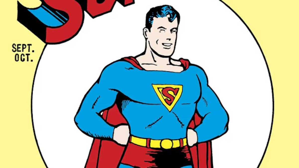
The distinctive red ‘S’ within a yellow triangle shield, first featured on the cover of Superman #1 and the initial issues of Action Comics, marks the quintessential logo from the Golden Age. Despite its straightforward appearance, it has become an iconic symbol that endured for the longest period during this era, before giving way to more standardized designs as the age progressed. This original design is frequently revisited when creating homages or comics set in the Golden Age, making it one of Superman’s most timeless logos.
7) Original Shield
The original Superman logo, which has never graced the pages of comic books, can only be found on the cover of the first issue of Action Comics and in this illustration, a rare early sketch by Joe Shuster. Unlike later logos, this one is a large shield reminiscent of a knight’s crest, reflecting Superman’s original gladiatorial design. Since the logo was too intricate for newspaper comic format, it wasn’t used in the actual comics. However, I believe it would be fascinating to see this classic logo reappear in modern stories that reference early comics, making it distinct from all other logos.
6) Wide Yellow Shield

Initially, Superman’s earliest emblems were compacted, resembling more triangles than traditional shields. However, this particular logo expanded the symbol to closely match the design of the familiar shield we recognize today. The ‘S’ became taller and less compressed, yet it didn’t fill the entire negative space, unlike later logos. The debut of this logo graced the cover of Superman #7, but it suffered a coloring mistake with the red and yellow sections reversed. The accurate representation appeared on Action Comics #33’s cover, depicting the ‘S’ floating within the large yellow area encircling it. This modification in width significantly enhances the shield design, although I personally favor a larger ‘S’, this one exudes a tranquil quality, similar to a serene lake.
5) New 52
In the New 52 reboot, every character underwent significant makeovers, including Superman. Although opinions vary on his armor-like costume, the emblem on his chest was a standout feature. The ‘S’ became more blocky, designed to look like an alien crest rather than an English letter. It may not have undergone major changes, but its thick, bold typography gives it a unique appearance that sets it apart from others. Some find the asymmetrical size between the left and right sides off-putting, but I personally think it’s quite stylish.
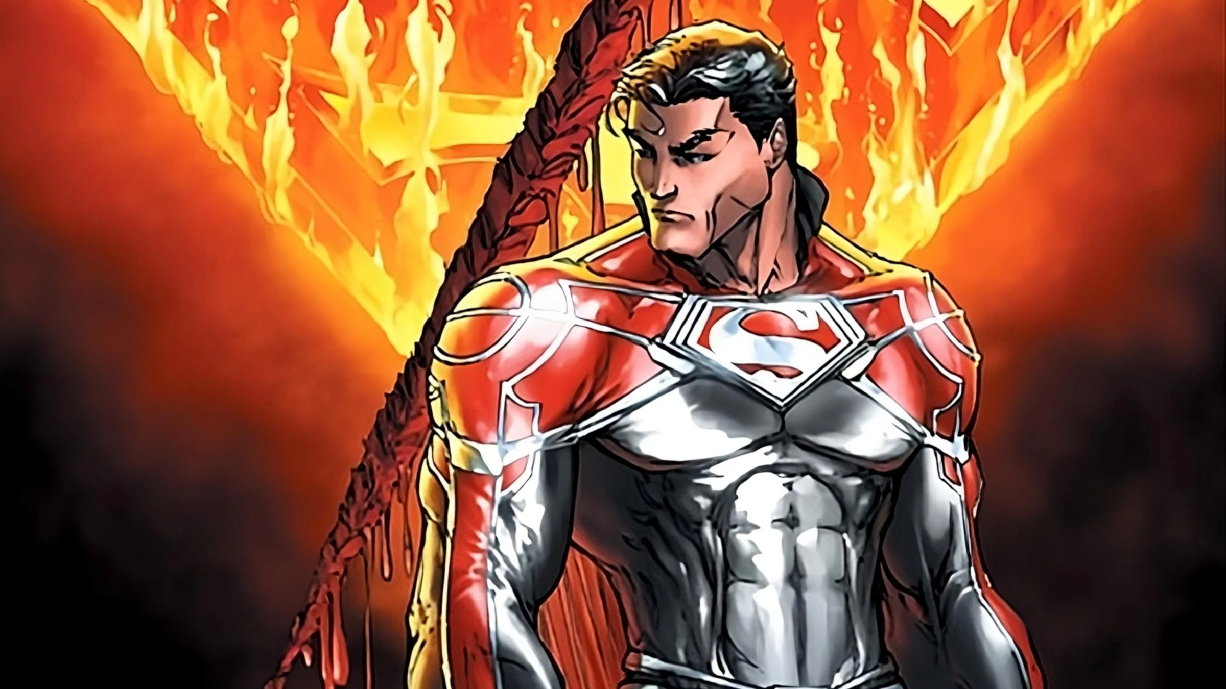
4) Black and Red

Few people are aware, but during the Adventures of Superman #596 in 2001, Superman’s logo underwent a temporary change to an all-red and black design. This somber transformation occurred as a tribute following the heart-rending “Our Worlds at War” storyline, where countless lives were lost. Despite its sad history, this redesigned logo is quite stylish. The black background serves as a rich backdrop, while the vibrant red adds an appealing contrast, creating a stunning and elegant symbol. The combination of red and black exudes a mature vibe reminiscent of the Kingdom Come design yet preserves the traditional S shape. This exceptional design deserves recognition, even though it was only used in the aftermath of a tragedy.
3) Red, Black, and Yellow
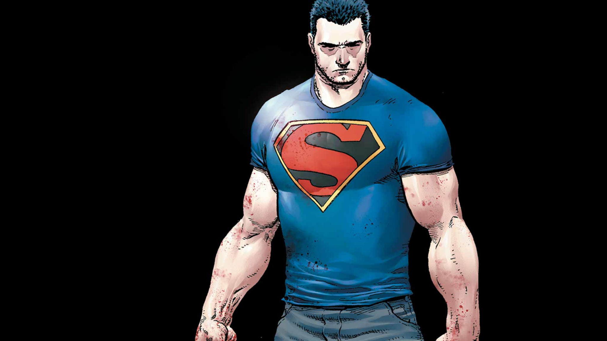
In the “Truth” storyline, Superman’s identity was exposed to the world and his powers were significantly reduced, making him more like his Golden Age self. Instead of his traditional Kryptonian suit, he started wearing a casual Superman t-shirt and jeans. This change in attire sparked much debate among fans, with some admiring it while others criticized it. However, the logo that came with this new look is considered one of the best by many. It retains the elegance and advantages of the previous black and red logo, but the yellow border adds a striking touch. This redesign of the classic logo remains my favorite, and it’s unfortunate that we only saw it for a brief period. I hope this logo makes a comeback, even if the rest of the suit might not be as appealing.
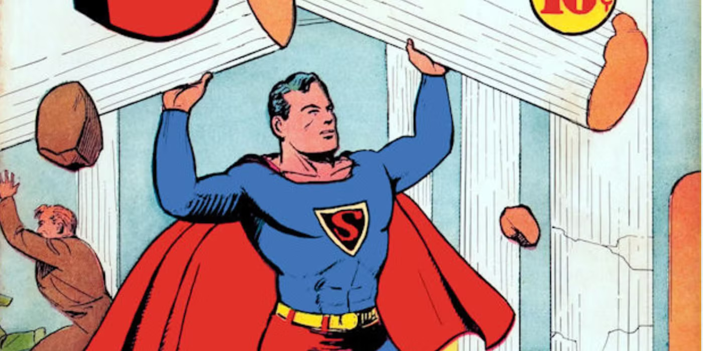
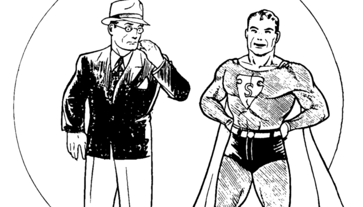
2) Original Standard

For the initial part of his career, the iconic Superman logo has been widely recognized. This emblem graced Superman’s chest from his debut in Superman #26 right up until the significant multiverse reboot in Crisis on Infinite Earths. Although there were minor adjustments over time, this design is the one that made Superman a global phenomenon and was trademarked long ago. It’s interesting to note that the preliminary form of this shield didn’t initially appear in the comics but rather in the first-ever painting of Superman by H.J. Ward. The legendary Curt Swan refined this symbol for widespread usage, making it one of the most influential artists (apart from Joe Shuster) in Superman’s history. This classic color scheme – red, blue, and yellow – has been synonymous with Superman for over four decades.
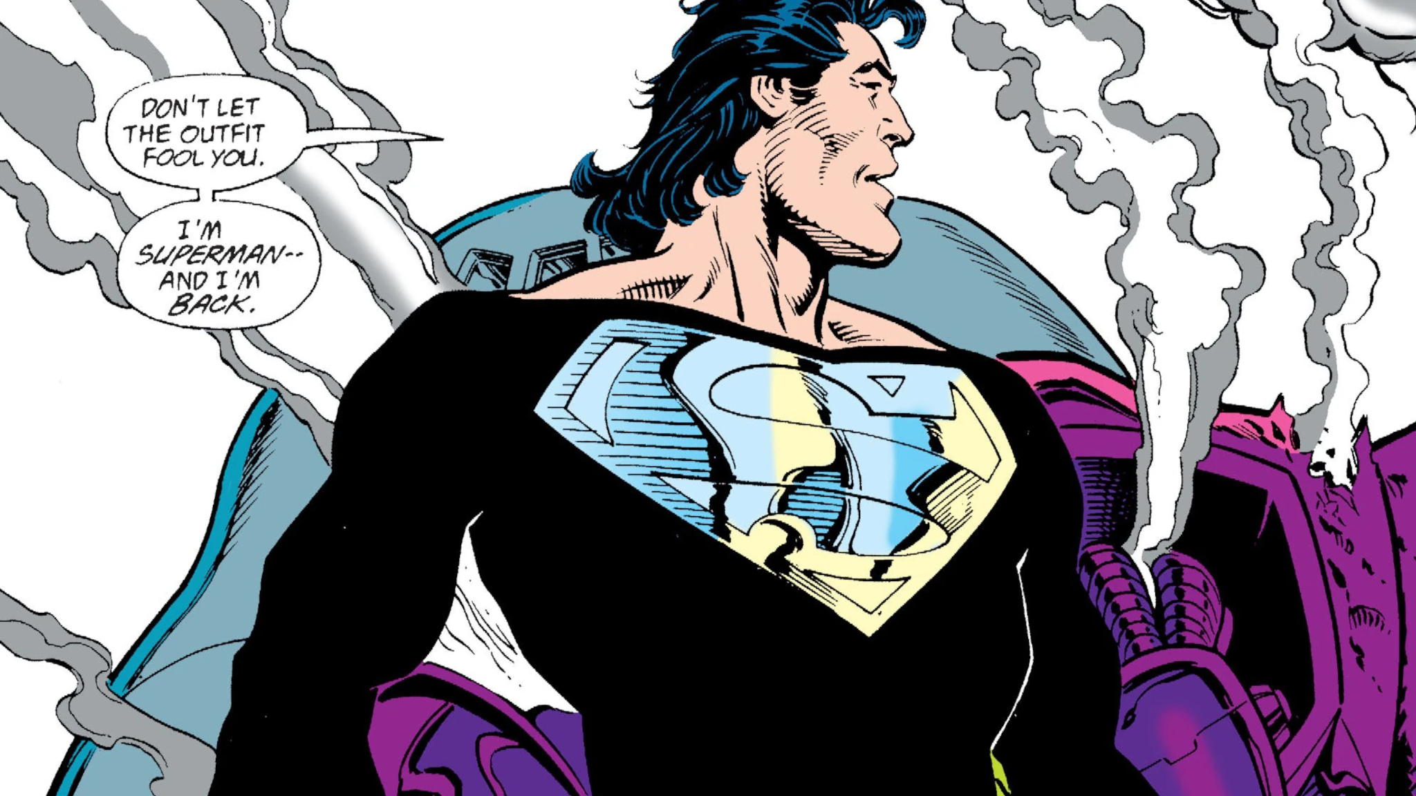
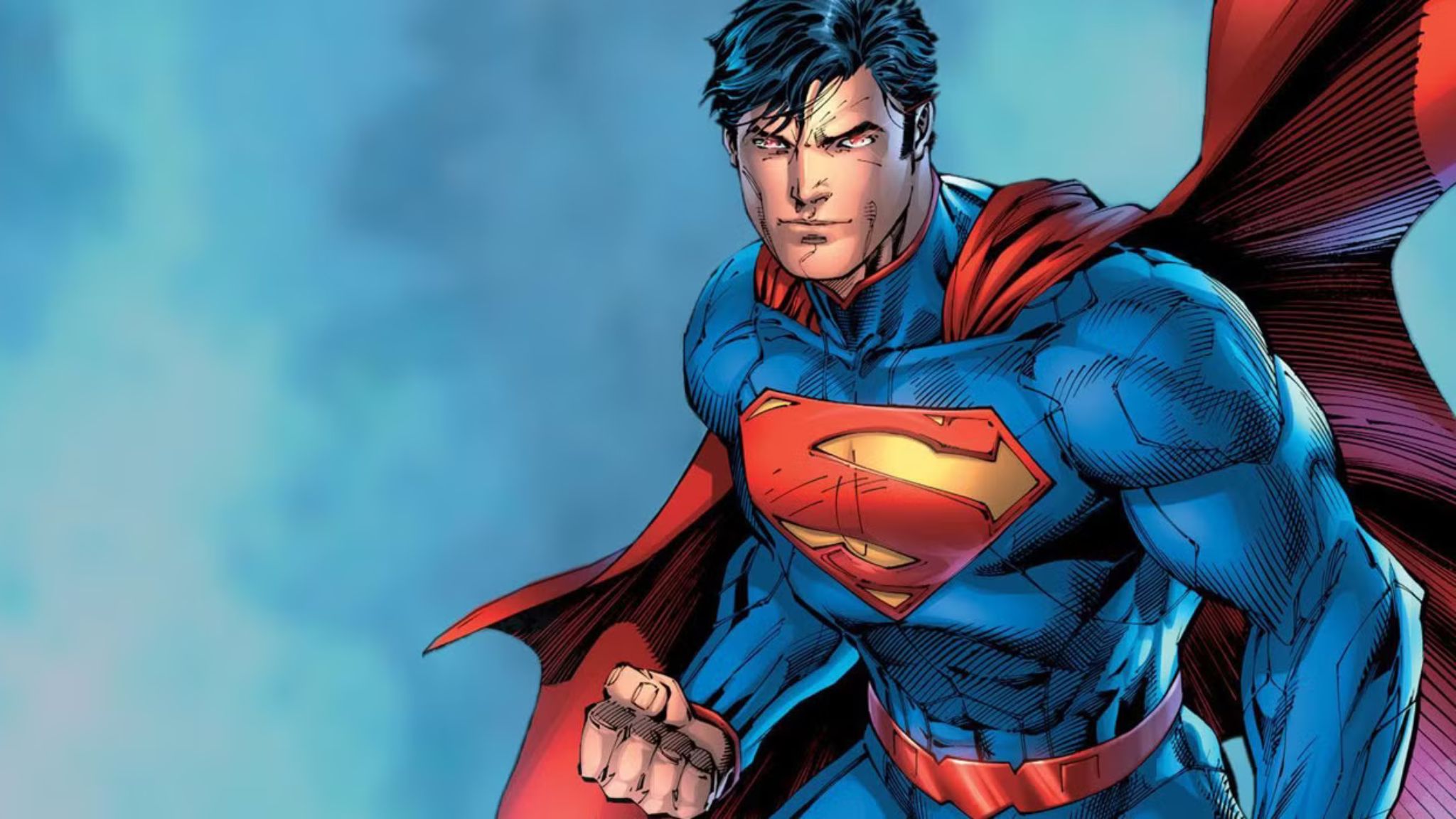
1) Post-Crisis Standard
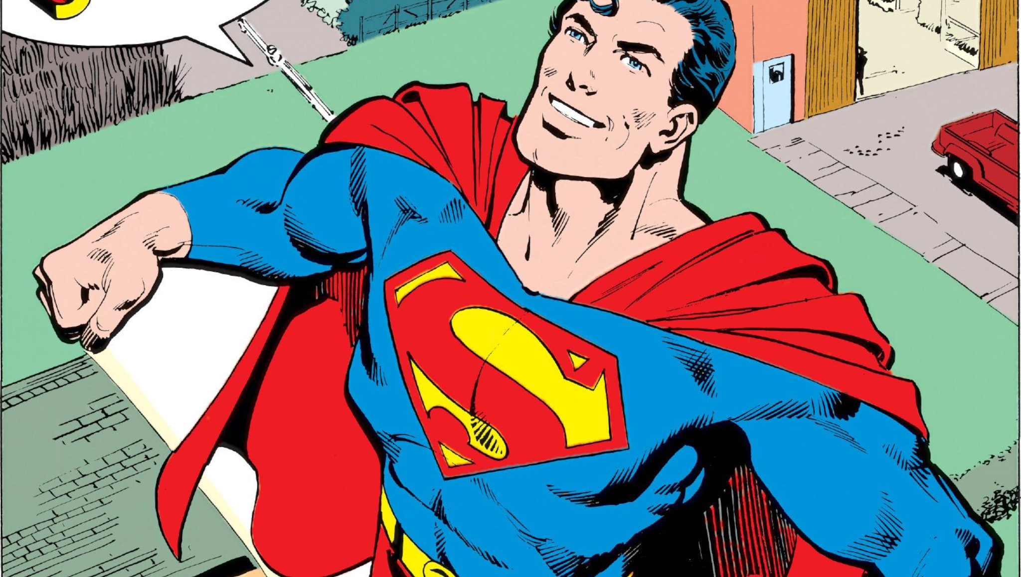
There’s no question about it – the Superman logo featured in John Byrne’s “Man of Steel” stands as the ultimate emblem for this iconic hero. This updated version enhances all the strong points of its predecessor, boasting a larger size and a more voluptuous, rounded S inside it. According to Byrne, his younger self visualized Superman’s symbol as two swimming yellow fish. This concept is evident in the revised logo design. The shield lines are straighter and taller, with the central part of the S being significantly thicker than before. In essence, this symbol embodies the spirit of Superman, one of the world’s mightiest heroes. When people talk about him or visualize the Man of Tomorrow, it’s this logo they have in mind. This timeless symbol is globally recognized and instantly evokes a sense of childhood wonder in anyone who lays eyes on it. A perfect 10, no doubt!
https://comicbook.com/comics/news/superman-every-version-ranked/embed/#
Read More
- What Song Is In The New Supergirl Trailer (& What It Means For The DC Movie)
- Why is Tech Jacket gender-swapped in Invincible season 4 and who voices her?
- The Super Mario Galaxy Movie: 50 Easter Eggs, References & Major Cameos Explained
- Highly Anticipated Strategy RPG Finally Sets Release Date (And It’s Soon)
- TV legend Carol Kirkwood reveals the reasons why she decided to retire after 28 years with BBC
- Dune 3 Gets the Huge Update Fans Have Been Waiting For
- Crypto Chaos: 6 Events This Week That Could Send Bitcoin and XRP into a Tailspin!
- Palworld! More Than Just Pals ‘Special Video’, characters detailed
- Robert Pattinson’s The Batman 2 Suit ‘Evolution’ Gets an Answer From Designers
- Game of the Month: Crimson Desert (March 2026)
2025-07-16 17:42