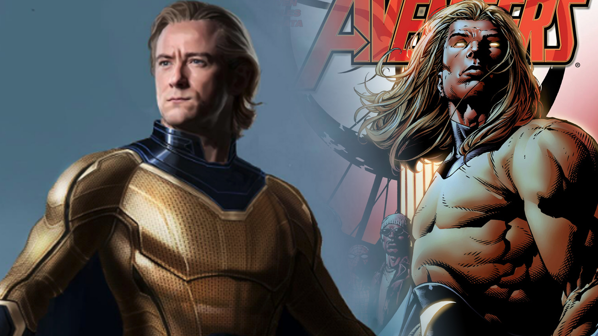
In the Marvel Cinematic Universe (MCU), The Sentry first made his impressive entrance in Thunderbolts, and Lewis Pullman’s portrayal of this powerful character was generally positively received by viewers. However, some criticisms were directed towards the costume design, a common issue when adapting comics to the big screen. Recently, fans have been treated to a sneak peek at a costume design that is more faithful to the comic book version, courtesy of artist John Staub. This artwork was shared by Constantine Sekeris, who worked on Marvel Studios Visual Development team during Thunderbolts’ production. As you can see in the post below, this new design appears to be closer to the original comic book costume than the one that appeared in the film.
In this post, Sekeris shared an early concept design of the Sentry costume from the Thunderbolts/New Avengers project when he was working at Marvel Studios. This particular version of the suit is a part of the initial exploration of the character’s appearance and will be featured in the Thunderbolts art book upon its release. Sekeris expressed gratitude to Andy Park, who led the project, as well as the talented team of artists including Ryan Meinerding, Wes Butt, John Staubart, Rodney Lee, J.S. Marantz, J.W. Sze, and Jihee Lee. Despite the challenges in conceptualizing the character, Sekeris had a great time exploring design options for Andy and the production team. Stay tuned for more updates, and when the Thunderbolts art book is out, you can see all the incredible design work done by everyone involved! #marvel #thunderbolts #newavengers #conceptart #sentry #characterdesign #zbrush #keyshot #photoshop
In my opinion, there are several distinct differences between the initial costume and the final version of this character’s attire, yet two alterations stand out the most: the inclusion of an ‘S’ emblem on the belt and the longer hairstyle. The suit’s lines also exhibit a more comic-book aesthetic, and the collar now closely resembles the comics version, suggesting inspiration from the New Avengers storyline that saw this character return. I find the updated Sentry symbol particularly appealing and believe it enhances the overall design compared to its previous iteration.
To clarify, while personal preference comes into play, it’s worth noting that the final costume design, as presented by Staub, wasn’t drastically different from this initial sketch. Upon closer examination of the final design post, you’ll find that the gold of the suit catches the eye and is quite striking. Additionally, the MCU-inspired lines and embellishments enhance the overall look. However, I must mention that the belt remains my least favorite aspect, particularly the S logo. The most significant difference lies in the color of the suit itself.
As a movie enthusiast, I must say that when I observe the costumes in the movie, there’s an intricate play with color shades that sets it apart. The darkest sections of those suits aren’t golden at all; they lean more towards a yellowish hue and grow even yellower as you move towards the center of the suit – barely resembling gold. However, in this final on-screen design, everything appears golden, with a slight variation in tone across different parts of the suit. It seems that some of that subtle nuance got lost during its transition from concept to reality on the big screen.
Between the two designs, I personally prefer a combination: Keep the final design’s sleek look but incorporate elements from the earlier version – such as adding a belt and the Sentry symbol, and styling the hair longer. This enhancement could potentially elevate the costume to an exceptional level. Maybe in future appearances of Sentry, we’ll witness something closer to this refined design.
Read More
- PI PREDICTION. PI cryptocurrency
- WCT PREDICTION. WCT cryptocurrency
- LPT PREDICTION. LPT cryptocurrency
- Guide: 18 PS5, PS4 Games You Should Buy in PS Store’s Extended Play Sale
- Gold Rate Forecast
- Shrek Fans Have Mixed Feelings About New Shrek 5 Character Designs (And There’s A Good Reason)
- SOL PREDICTION. SOL cryptocurrency
- Playmates’ Power Rangers Toyline Teaser Reveals First Lineup of Figures
- FANTASY LIFE i: The Girl Who Steals Time digital pre-orders now available for PS5, PS4, Xbox Series, and PC
- Despite Bitcoin’s $64K surprise, some major concerns persist
2025-05-31 19:45