Comic books combine art and storytelling in a powerful way. They’re special because they use both pictures and words to create a complete experience for the reader. Great art is crucial to comics, and over the years, many incredibly talented artists have contributed to the medium. Today, we’re honoring one of the best: Neal Adams. He’s one of the most important comic book artists ever, and his work on Batman in the 1970s and 80s completely changed the character, shaping the modern Batman we all know and love. In fact, it’s hard to imagine Batman as he is today without Neal Adams’ contributions.
Neal Adams was an incredibly talented artist, and while he’s famous for his work on Batman, his impressive career included many other fantastic titles. His Batman art is rightfully celebrated, but often overshadows the amazing work he did elsewhere. Today, we’re highlighting ten of Neal Adams’s best comic book covers that aren’t Batman related. It’s tough to narrow it down – this list could easily be much longer – but these ten really stand out to me. Let’s take a look at some of Neal Adams’s wonderful art!
10) Challengers of the Unknown (1958) #74
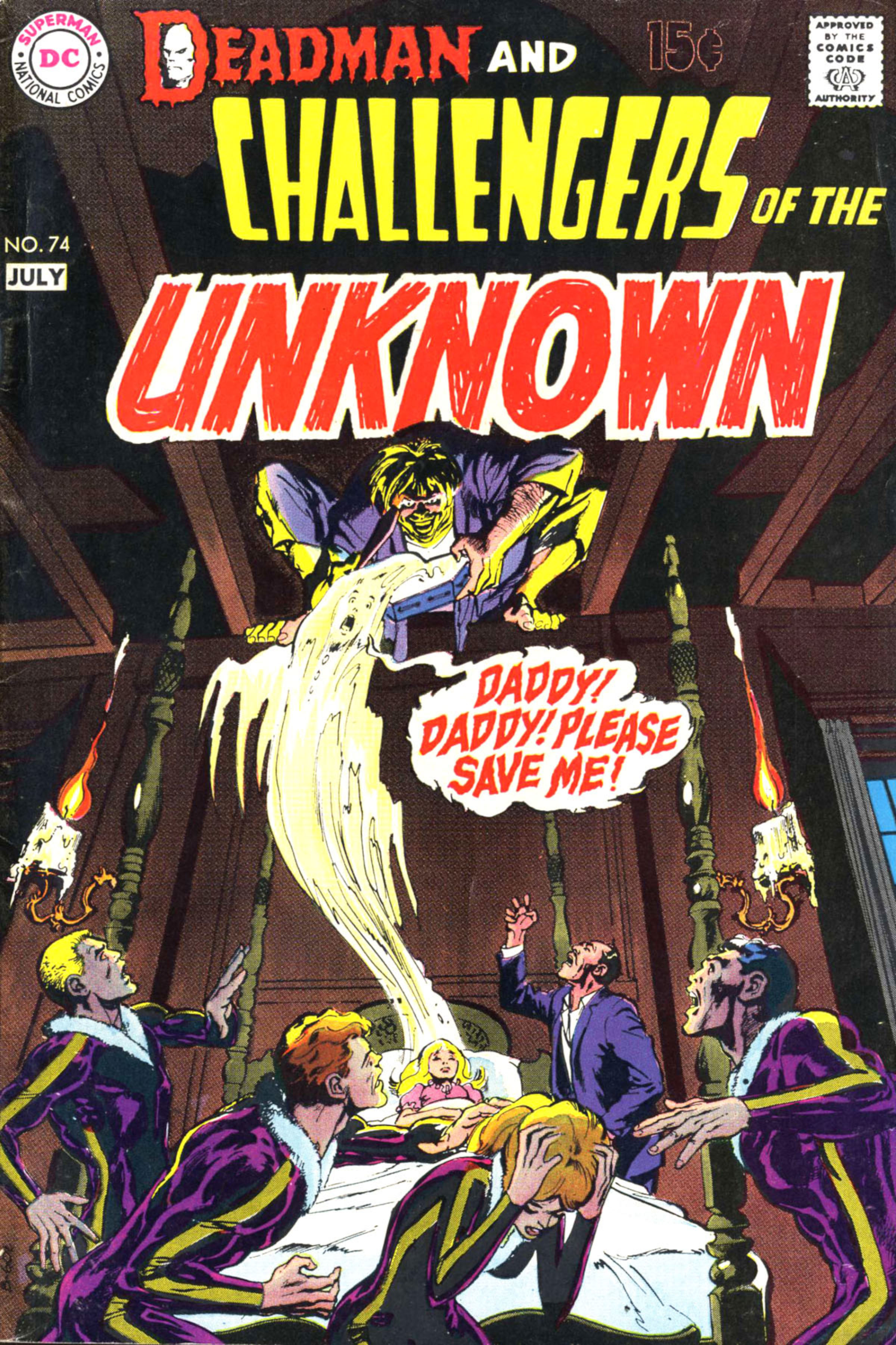
Neal Adams was a master at creating a chilling atmosphere in his artwork, and this cover perfectly showcases his talent. The fear and panic are vividly expressed through the body language of the Challengers and the father. It’s impressive how effectively he portrays such a variety of reactions on a single image. The figure lurking in the shadows is deeply unsettling, and the depiction of the girl’s spirit being pulled from her body is disturbingly compelling. What really stands out is the perspective – the girl appears incredibly small and vulnerable lying in such a large bed, amplifying her helplessness. Overall, it’s a genuinely creepy and effective cover.
9) House of Mystery (1951) #178
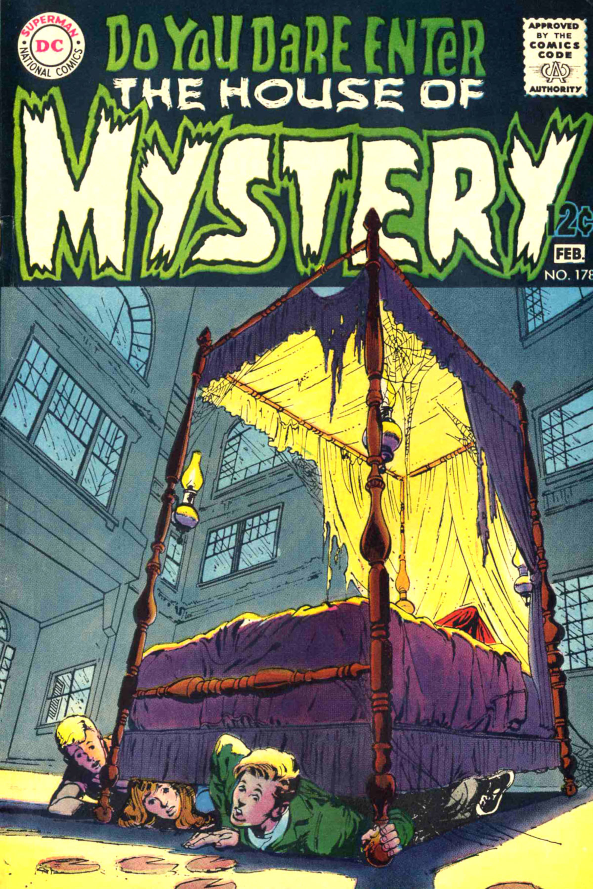
This book cover initially seems harmless, but the more you study it, the more unsettling it becomes. The only furniture in the huge room is a bed, placed directly in the center. The ceiling is impossibly high, and the bed feels enormous, even though the children couldn’t all hide underneath it. It feels both protective and threatening, like a giant mouth about to close. Each small detail adds to the disturbing feeling, which is brilliantly done. There’s nothing overtly supernatural, but the cover creates a strong sense of dread. It’s a perfect example of how everyday objects can be used to create genuine terror, reminiscent of classic Neal Adams artwork, and it’s incredibly effective.
8) Superman (1939) #233
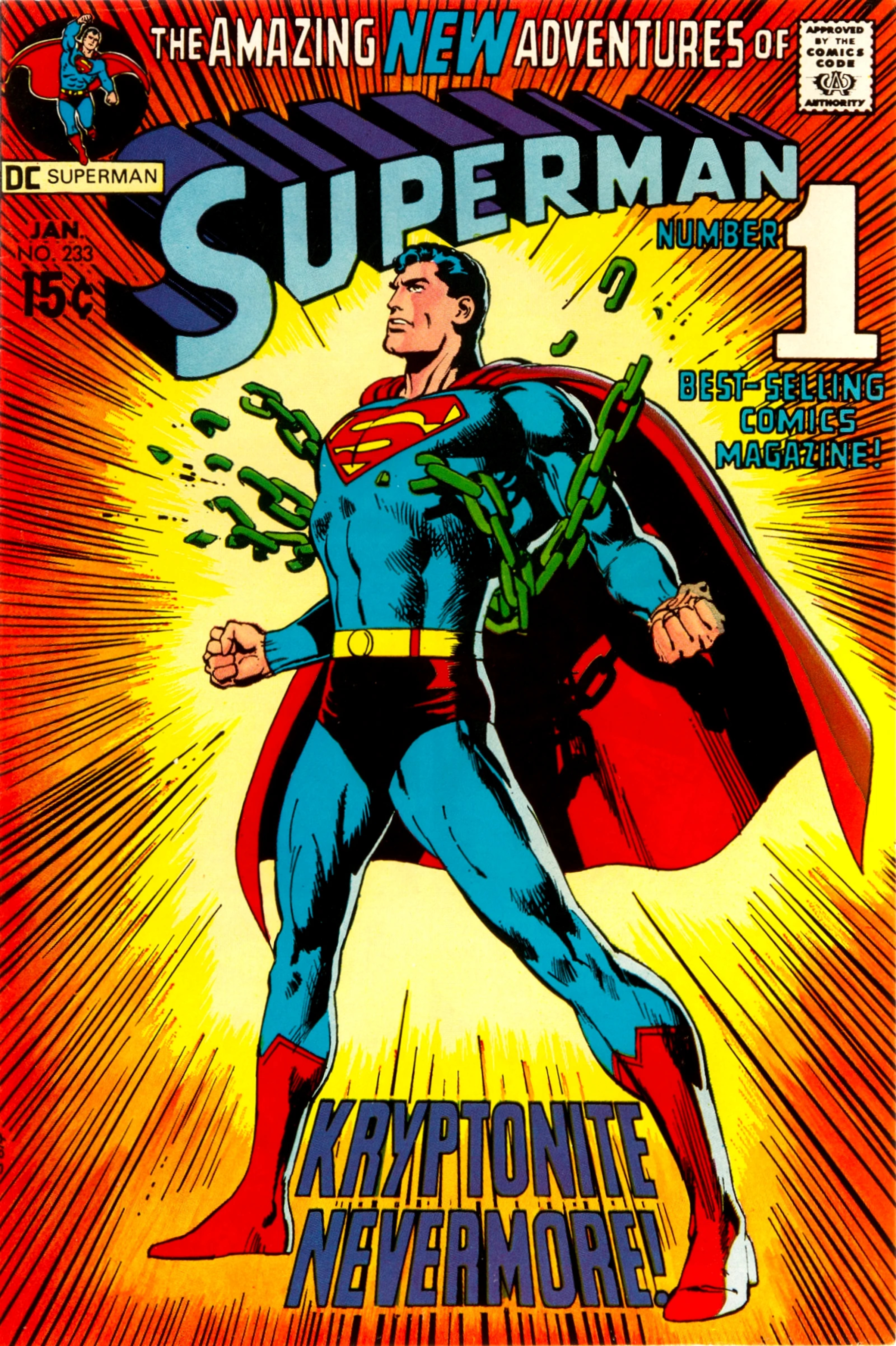
This Superman cover by Neal Adams is remarkably simple: Superman bursts free from Kryptonite chains, surrounded by dynamic lines. Despite its simplicity, it’s become one of his most recognizable images. The idea of Superman breaking those chains has become iconic and has been widely referenced and copied, even inspiring the current DC Studios logo. Interestingly, Adams himself wasn’t thrilled with how famous the cover became, but it’s easy to see why! It’s clean and effective, and while other covers showcase Adams’s more complex artistry, this understated style is something I particularly enjoy.
7) The Unexpected #113
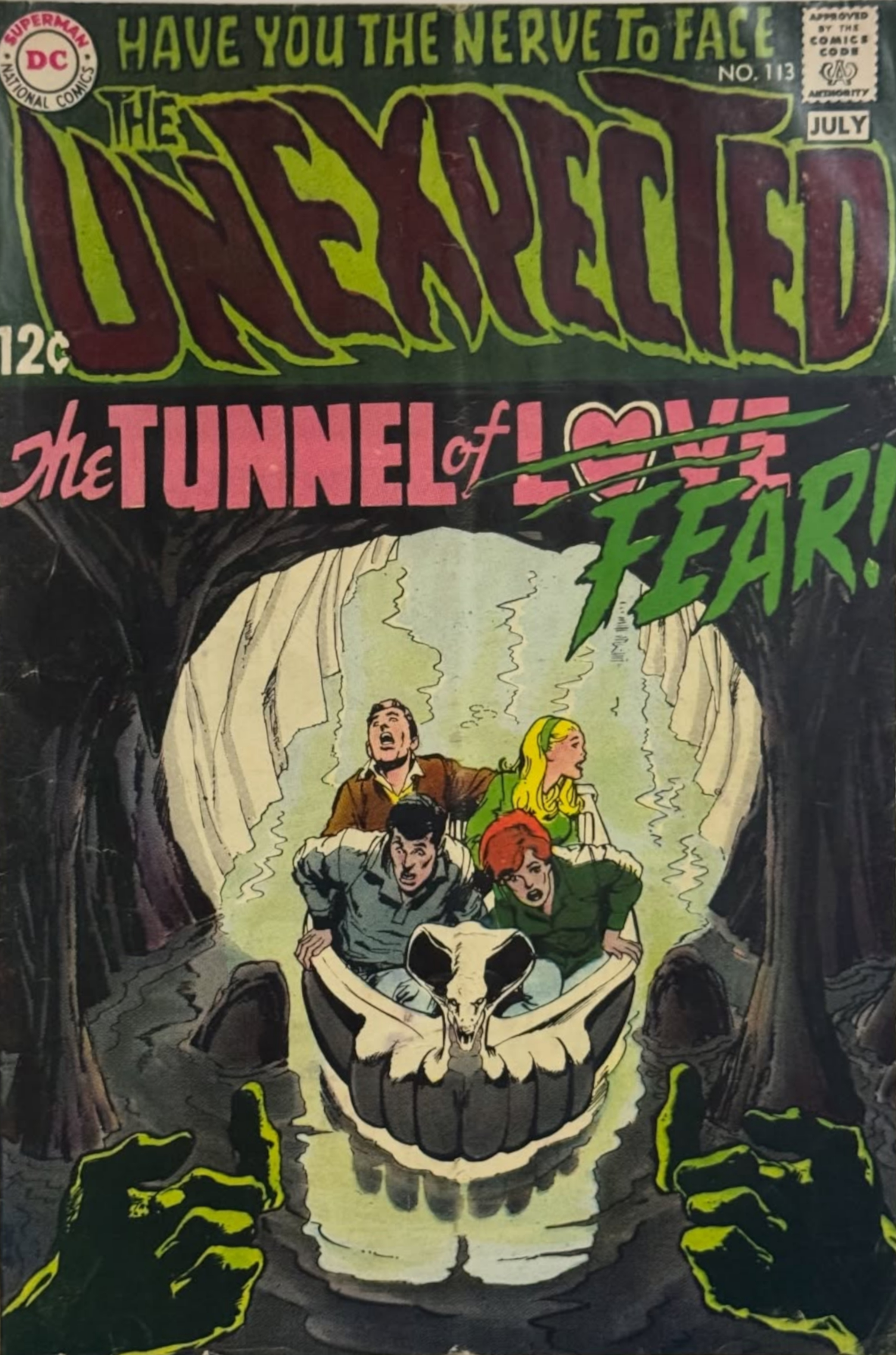
This cover art is technically brilliant. The artist cleverly used every element – the cave, the lighting, even the boat – to form the shape of a skull. It’s a bold idea that could easily feel cluttered or confusing with such realistic artwork, but Adams pulls it off flawlessly. The rest of the cover is also excellent; the hands reaching out to the teenagers dramatically increase the sense of horror. Adams once again demonstrates his skill at portraying emotion, giving each passenger on the boat a distinct and believable reaction. The skull itself is strikingly beautiful, and this is some of Adams’ most chilling work yet.
6) X-Men (1963) #58
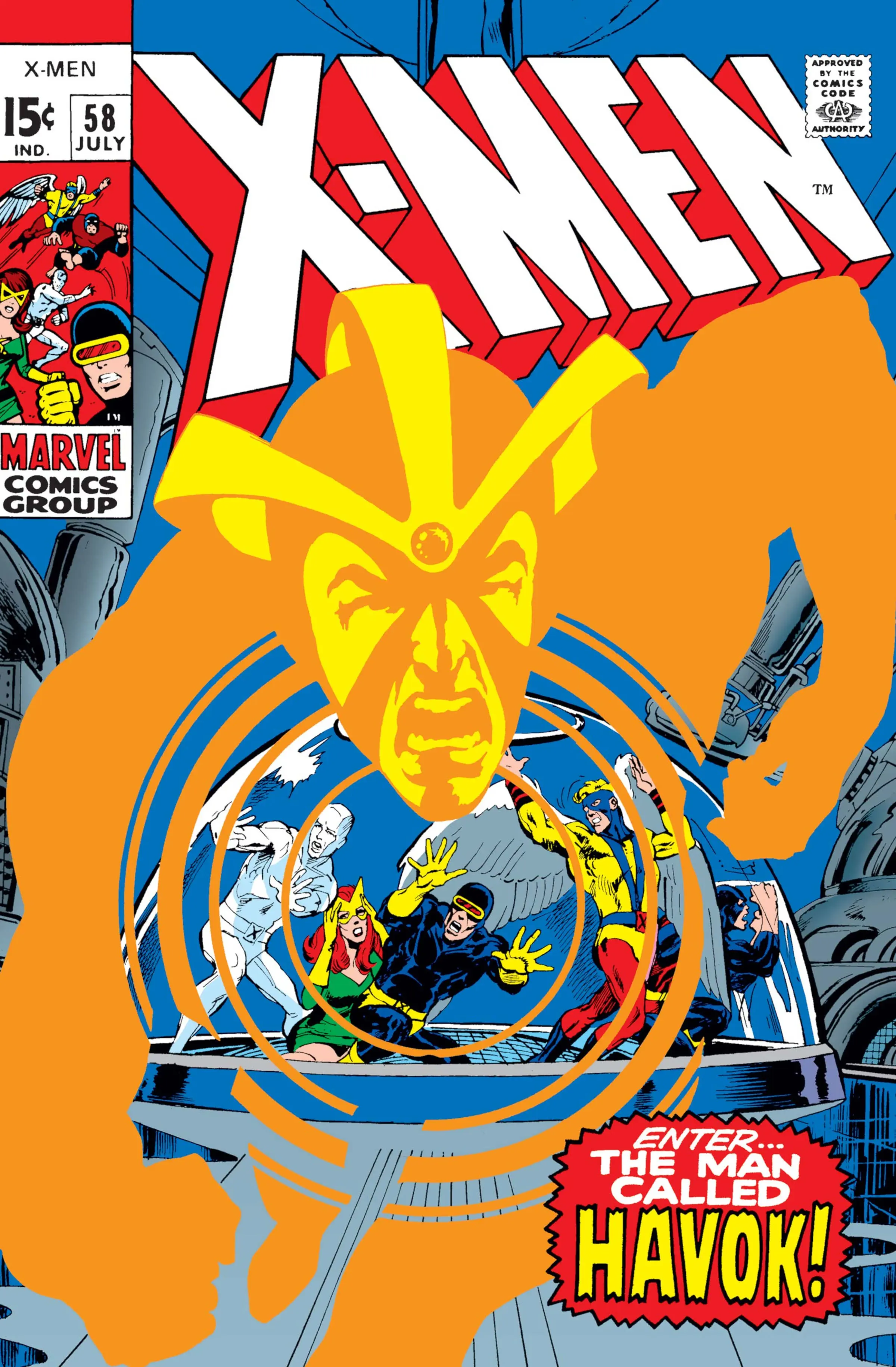
Let me tell you, Neal Adams’ brief run on X-Men was a total game-changer. One panel, in particular, still blows me away. The X-Men are visually imprisoned inside a glass dome, and Havok is bursting out of the page towards you. What’s brilliant isn’t just the dynamic action, but how Adams uses Havok’s insignia – it cleverly makes the dome look like his symbol, visually trapping the team. It’s a fantastic way to show Havok’s power and foreshadow their impending doom. Honestly, it’s one of the most creative uses of a character’s design I’ve ever seen in comics.
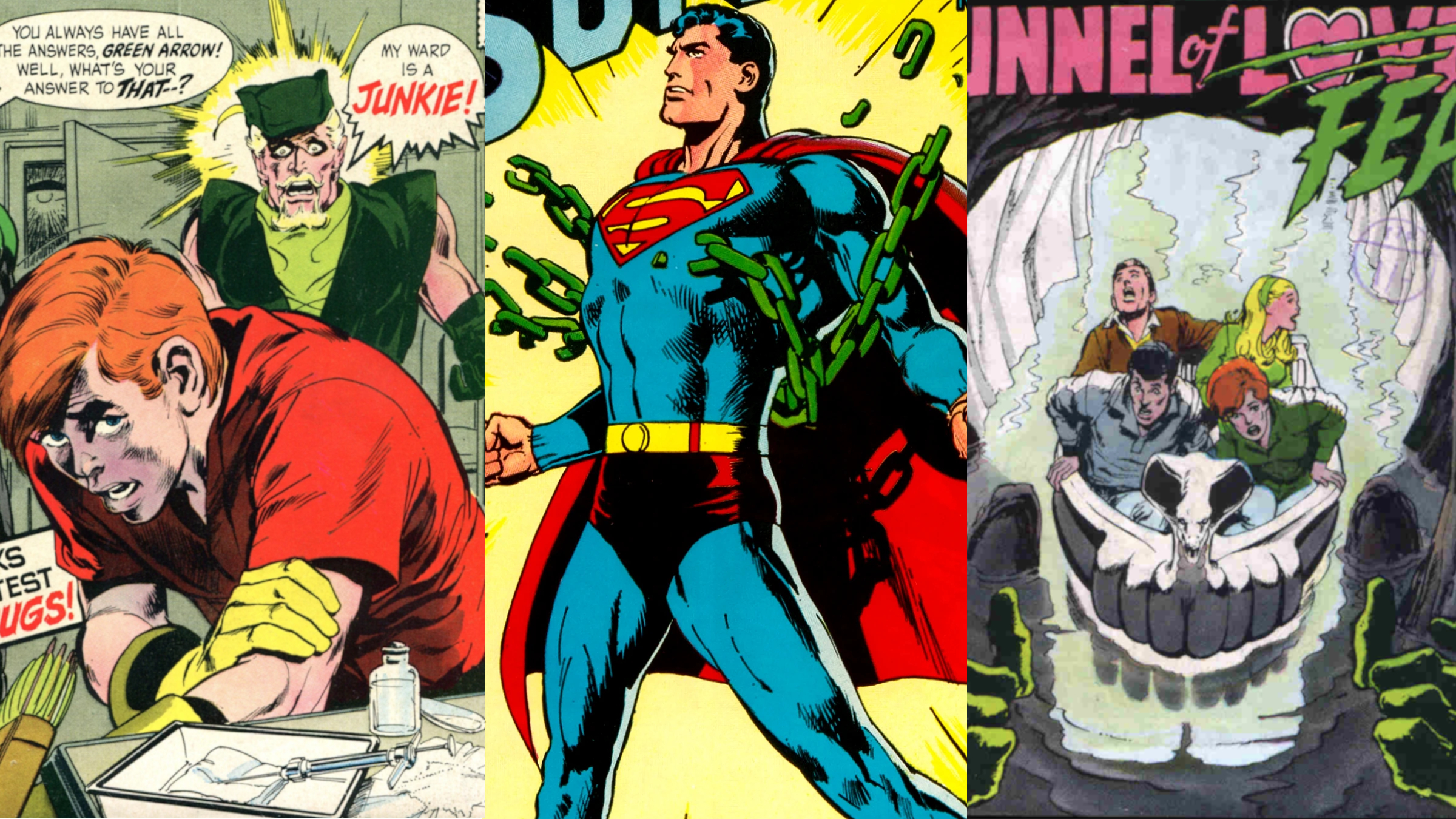
5) Green Lantern & Green Arrow (1960) #85
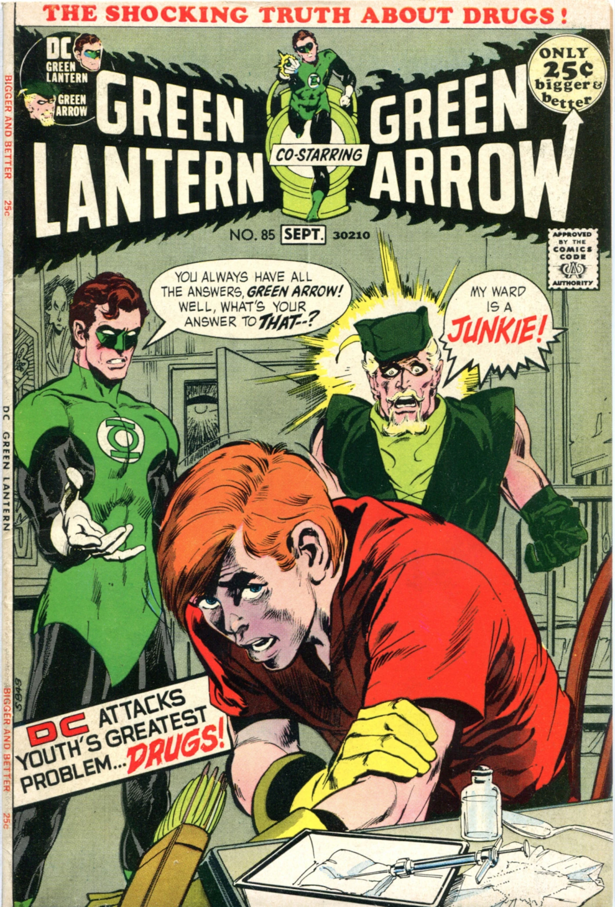
This cover is deeply shocking and unexpected for a superhero comic – it depicts a young man preparing to use heroin. The artwork is cleverly designed like a panel from the story itself, immersing the reader in the scene and forcing them to witness Roy’s struggle as Ollie comes to a devastating realization. While the background is intentionally blurred, this draws even more attention to the heartbreaking scene in the foreground. It’s a truly iconic cover, and most people remember the impact of seeing this image for the first time.
4) Green Lantern & Green Arrow (1960) #76
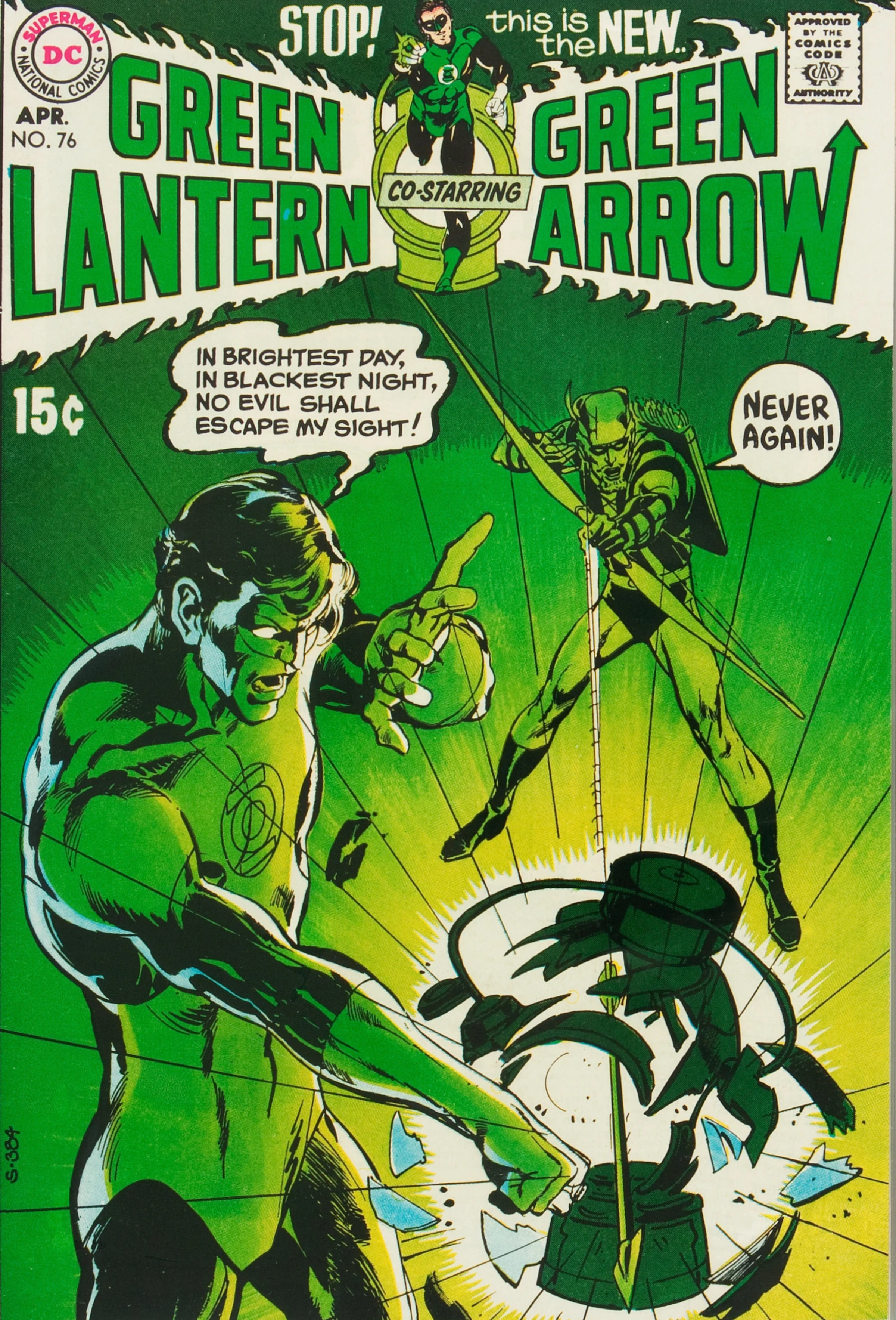
This list could easily be filled with covers featuring the work of Neal Adams, but #76 stands out due to its striking clarity. The image of Green Lantern trying to power his ring while reciting the classic oath, only to have his power battery destroyed by a single arrow, is instantly recognizable to comic book fans. The artist perfectly captures the shattering of the battery with each shard and dynamic line, and Hal Jordan’s shocked expression speaks volumes. It’s an iconic cover with a simple yet powerful design.
3) X-Men (1963) #59
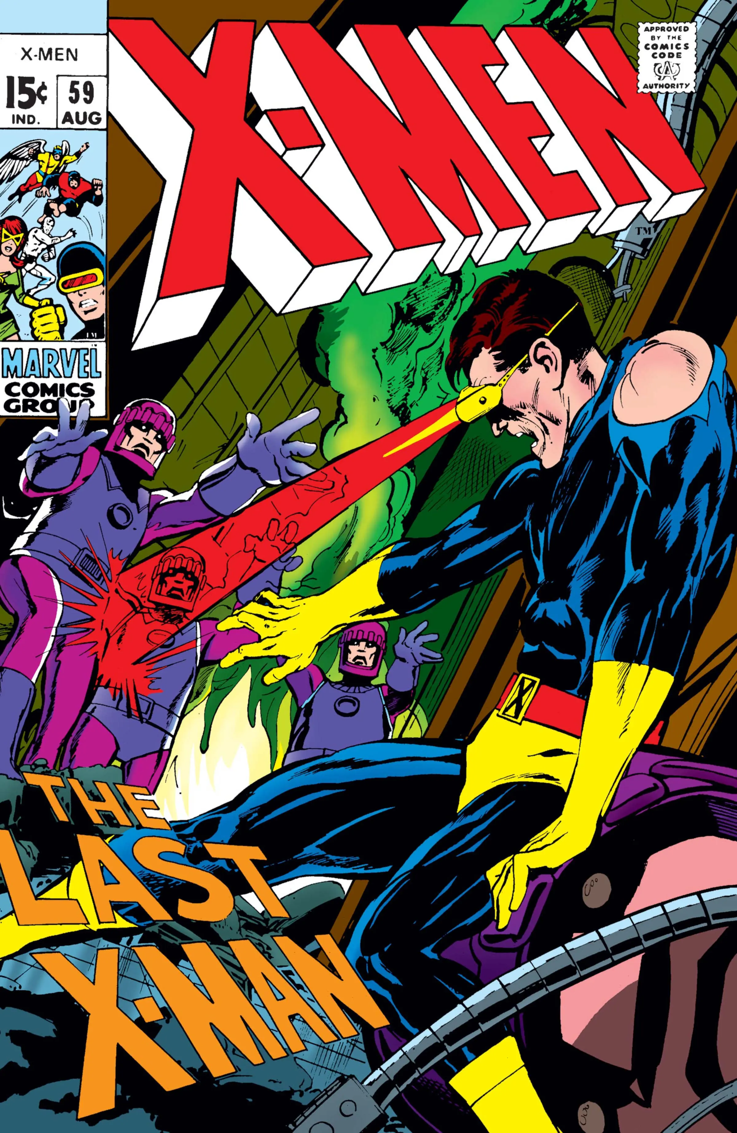
This cover perfectly captures the essence of a great Adams illustration: a dynamic perspective, intense fear you can almost feel, and a fantastic portrayal of the hero’s strength. The Sentinels surround Cyclops like relentless zombies, and he appears completely drained, yet still fighting with everything he has. Adams brilliantly uses Cyclops’s powers, showing him unleashing a powerful blast even as he’s visibly terrified. The slightly askew title, “The Last X-Man,” adds to the sense of chaos and urgency. It truly feels like you’re thrown right into the middle of an action-packed movie scene – exactly the impact a superhero cover should have.
2) Strange Adventures #213
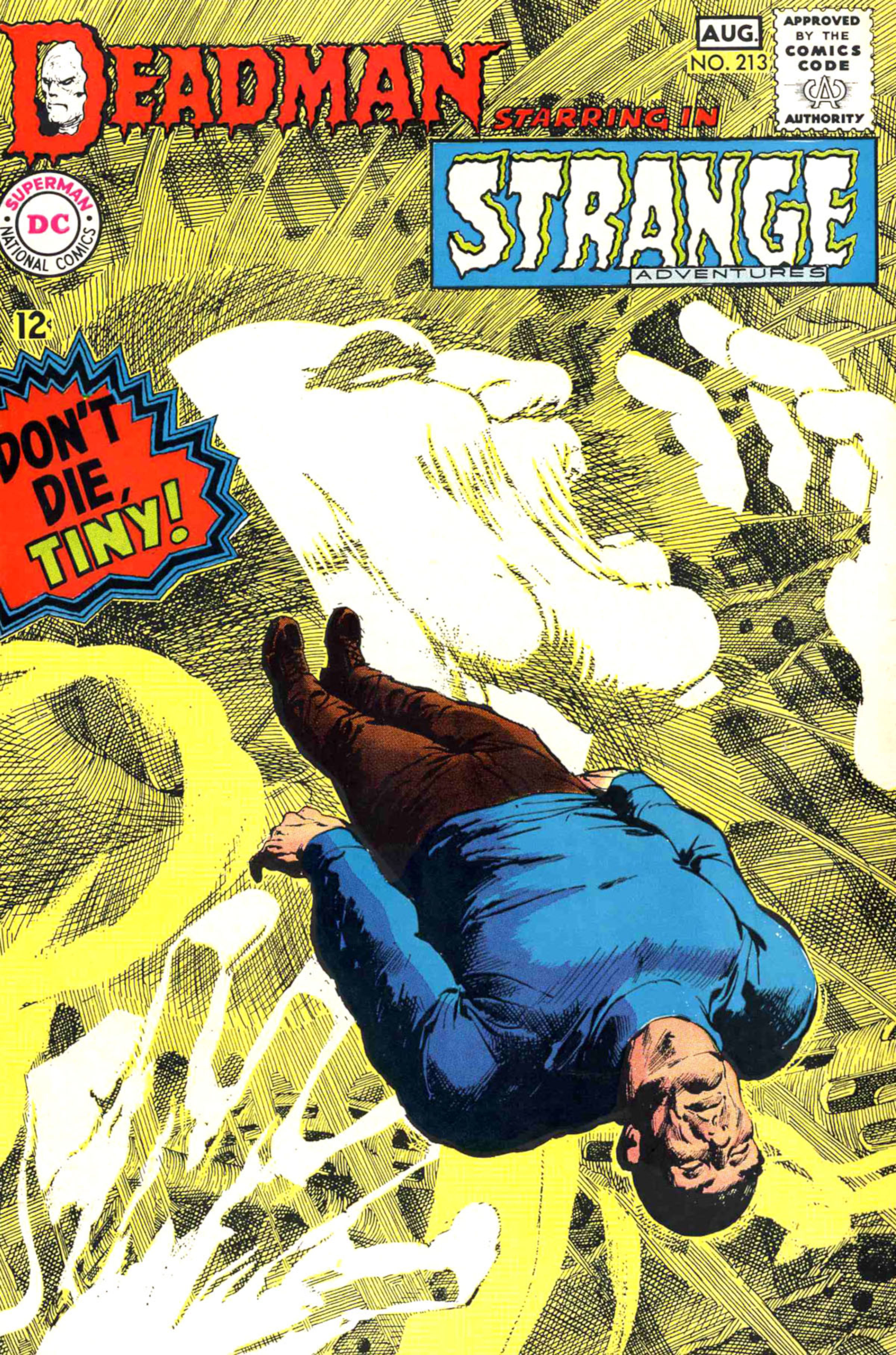
This cover is incredible. Tiny’s pose is brilliantly done, creating the illusion that he’s both drifting on the water and lying still. But the real standout is Deadman – the crosshatching is phenomenal. It perfectly captures his ghostly nature, making him feel like a spirit who doesn’t belong here. While he appears otherworldly, his anguish is deeply relatable, and his scream feels viscerally impactful. This cover embodies the haunting, terrifying atmosphere that defines Adams’s best work, and it remains a strikingly powerful and vivid image.
1) Superman (1939) #252
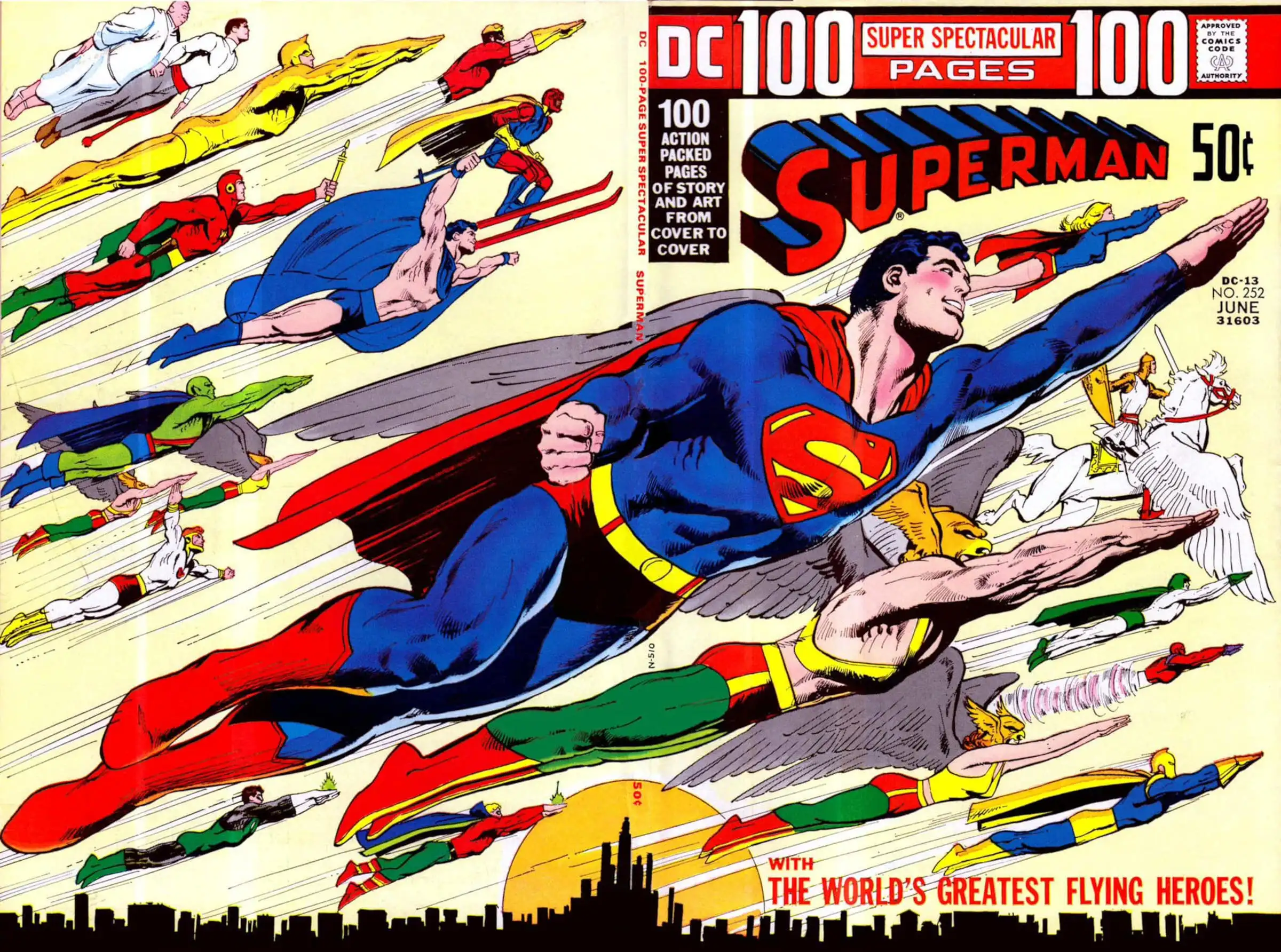
In my opinion, the cover for Fylying Heroes is Neal Adams’ best work outside of his Batman illustrations. It brilliantly depicts twenty-one of DC’s flying heroes soaring into the sky, with incredible attention to detail – Hawkman’s wings are especially impressive. While it features a large group, the artwork doesn’t sacrifice quality. Superman truly shines, looking relaxed and sporting a simple, joyful smile. The cover perfectly captures a peaceful, classic Superman vibe, and really highlights Adams’ talent for bringing these characters to life.
https://comicbook.com/comics/list/10-best-jim-lee-covers-that-changed-comic-history/embed/#
Read More
- Adam Levine Looks So Different After Shaving His Beard Off
- After AI Controversy, Major Crunchyroll Anime Unveils Exciting Update
- Gold Rate Forecast
- Japan’s No. 1 Spring 2026 Anime Is the True Successor to an All-Time Great
- Xbox Game Pass Users “Blown Away” by New Exclusive Game
- Dialoop coming to Switch on June 17
- From season 4 release schedule: When is episode 2 out on MGM+?
- When Things Fall Apart: A New View of Phase Transitions
- Neverness to Everness launch trailer; music collaborations announced
- USD JPY PREDICTION
2026-04-24 00:13