Players and critics loved *Ghost of Tsushima*, largely because of its beautiful and accurate depiction of Tsushima Island in Japan. Now, with the sequel, *Ghost of Yōtei*, releasing in just over a week, art director Joanna Wang has discussed how the new game will build on the original’s strong cultural foundations while introducing a different setting: the Hokkaido region.
When asked about how much of *Ghost of Tsushima* would be present in *Ghost of Yōtei*, Wang explained that while the games are set in different times and places, some core cultural elements will carry over. The team was able to build on what they learned making *Ghost of Tsushima*, and they received guidance from experts to accurately portray the Hokkaido setting.
We aimed for a beautiful, minimalist style, much like traditional Japanese art. By removing unnecessary elements, we wanted the core ideas and details to really shine and create a richer, more immersive world. This influence from Japanese art and culture is central to the visual style of *Ghost of Yōtei*.
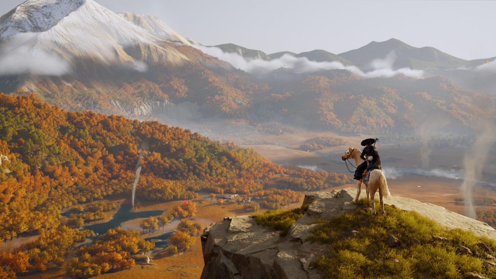
Wang discussed the visual changes in *Ghost of Yōtei*, noting it uses a more vibrant color scheme than the first game. She explained the sequel will take place in a sprawling, wild, and isolated land. The game’s different areas will each have a unique feel, reflecting distinct seasons, colors, and overall atmosphere.
According to Wang, the game’s landscape is vast and expansive in all directions. They aimed to create a world that felt more dynamic, colorful, and full of life than Tsushima. This is achieved through details like the aurora borealis in the night sky, sunrises with drifting clouds, birds in flight, and windswept fields. The overall effect is a sense of a land that is untamed, unpredictable, and powerfully alive.
Unlike the island of Tsushima, this game’s world is incredibly diverse. Each area feels unique, with its own distinct atmosphere, season, and colors. This variety helps players feel more connected to the game and enhances their overall experience.
Wang explained that the frequent use of yellow in the marketing for *Ghost of Yōtei* was intentional. She was very particular about the specific shade, as it connects to important story themes and the main character, Atsu.
She described how, sixteen years earlier, she lost everything – her family and home. She was tied to a ginkgo tree and left for dead, while yellow leaves fell around her as the tree caught fire. The color yellow, featured at the start of the game, symbolizes her destroyed hometown and is a recurring theme in her story.
Her outfit is yellow, inspired by ginkgo leaves, and symbolizes her history, emotional wounds, and hidden pain. Yellow will reappear throughout the game as a subtle clue, helping players uncover the details of Atsu’s life and understand her story.
The game *Ghost of Yōtei* will be released on PlayStation 5 on October 2nd. You can find more information in the recently released cinematic trailer.
Read More
- 4 TV Shows To Watch While You Wait for Wednesday Season 3
- Gold Rate Forecast
- Best X-Men Movies (September 2025)
- All 6 Takopi’s Original Sin Episodes, Ranked
- 10 Best Buffy the Vampire Slayer Characters Ranked
- 40 Inspiring Optimus Prime Quotes
- 10 Most Memorable Batman Covers
- Every Creepy Clown in American Horror Story Ranked
- PlayStation Plus Game Catalog and Classics Catalog lineup for July 2025 announced
- 10 Best Anime to Watch if You Miss Dragon Ball Super
2025-09-22 19:11