When Pokémon Winds and Waves was announced, it felt like a welcome change. Previous games – Sword and Shield, Scarlet and Violet, and Legends: Z-A – had disappointed so many fans that it was hard to believe the series could get better. I honestly thought Pokémon had peaked and we were stuck with games that didn’t live up to their potential, especially considering how much money the franchise makes.
It’s still too early to say if the new Pokémon games will be amazing, and I don’t want to jump to conclusions based on just the first trailer. However, I’m more hopeful than I’ve been in a long time that they’ll be truly good. A big reason for this is the improved graphics, which are a significant step up from Scarlet and Violet and immediately caught my attention. I’ve seen some reports that the visuals don’t look as polished as they should, and that the games still feel like they’re running on older technology – something I’ve thought before. But I think those criticisms miss the bigger picture. Pokémon Winds and Waves demonstrates something that’s always been true for the Pokémon series, and for Nintendo games in general: impressive graphics aren’t essential to a great game.
Pokémon Winds And Waves Prioritizes Style Over Fidelity
For a while now, the visual style of Pokémon games has seemed uncertain. The most recent generations (8 and 9) rely heavily on typical anime looks, with bright colors that appear appealing at a glance, but lack detail, sharpness, and a unique personality when viewed closely. The design of the game regions and environments has noticeably declined, particularly with the move to full 3D graphics. Fields and forests no longer have the same enchanting feel they once did in older games. Even familiar structures, like the Pokémon Center, have been redesigned with a more modern look, losing their original charm and nostalgic appeal.
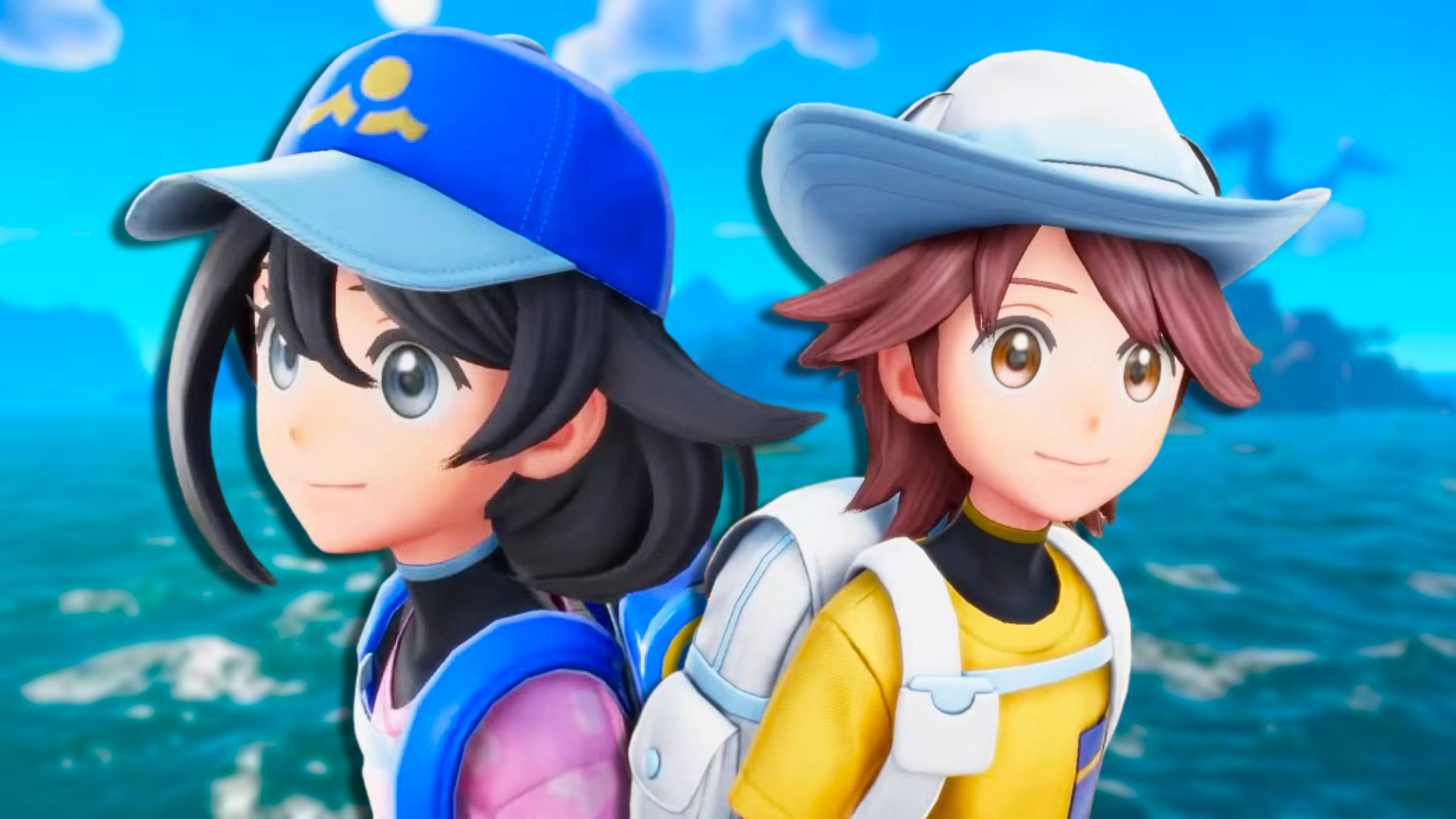
Aside from the character designs, which still look great, the overall visual style of recent Pokémon games felt different from what fans expect. That’s why I’m optimistic about Winds and Waves; it seems like the developers are trying to recapture the unique artistic flair of games like New Pokémon Snap. Honestly, it’s a welcome change. While the new style is a bit cleaner than I personally prefer, it has that special, quirky Pokémon feel – a beautiful blend of different cultural and architectural ideas.
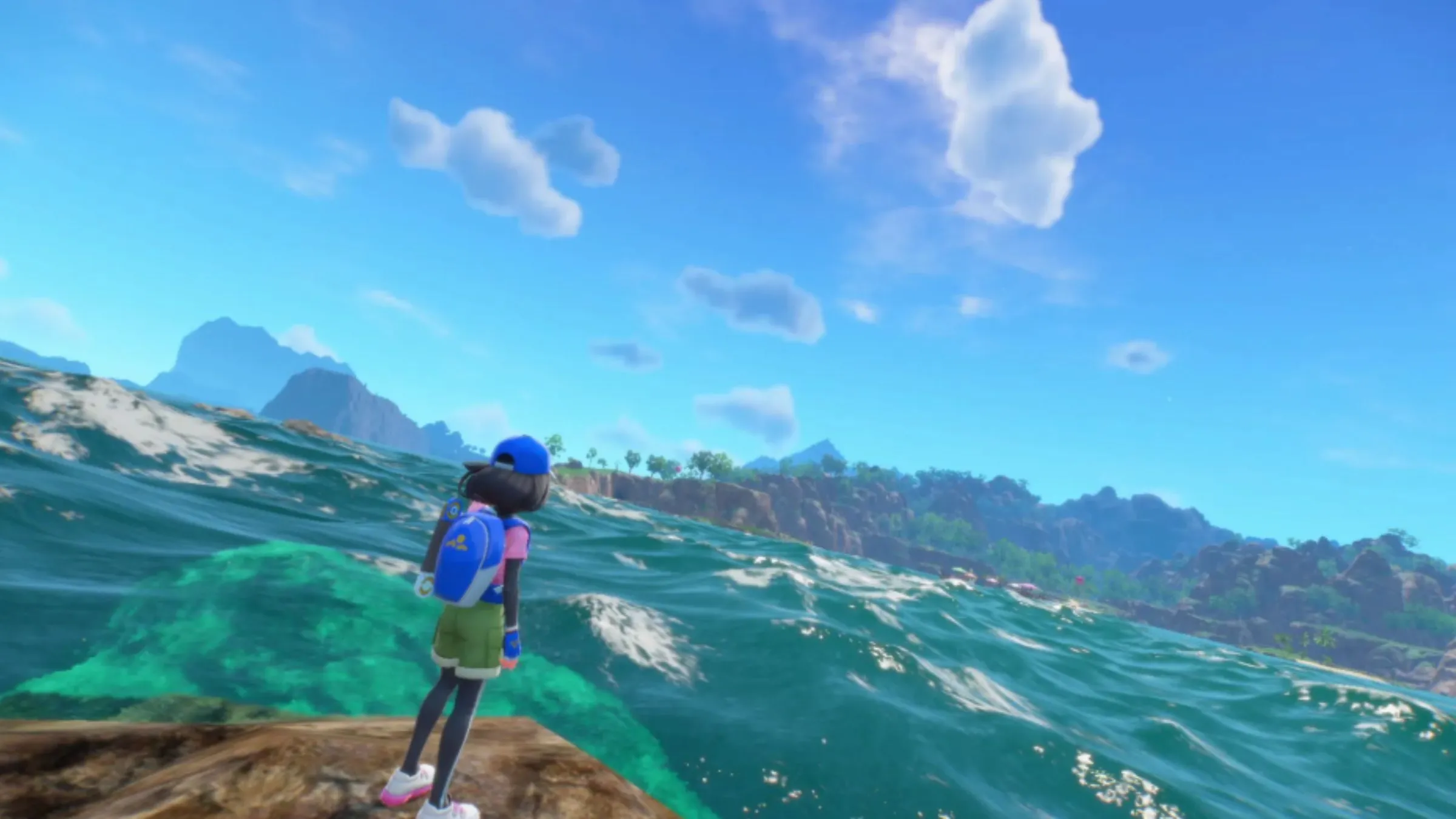
I don’t mind that Pokémon Winds and Waves doesn’t have the high-end graphics of a PlayStation 5 game. While free games like Genshin Impact and Seven Deadly Sins: Origins look much more advanced, Nintendo has always prioritized a distinctive style that remains appealing over time. Games like Mario and Zelda, and even Xenoblade, have successfully done this – older Mario games still look great today. Pokémon used to achieve this too, but recent titles, especially Scarlet and Violet, felt outdated rather than intentionally stylized. I’m happy Winds and Waves has gone for a more classic look, which will likely hold up much better than the graphics in the last generation of Pokémon games.
Nintendo Games Don’t Need To Look Next-Gen, But They Do Need To Look Good

I’ve always loved how Nintendo games look, and it’s not about raw power. Because their consoles aren’t always the most powerful, they’ve smartly focused on bright, clean art styles instead of trying to be super realistic. That’s actually why so many GameCube games still look amazing today – they’re not just holding up, they’re teaching us about good design! Think about the gorgeous, Studio Ghibli-inspired look of Breath of the Wild, or the simple, colorful world of Mario. Even games like Xenoblade Chronicles and Fire Emblem with their anime style, just work. They avoid that weird, unsettling feeling you get with some graphics, and they still manage to be beautiful and impressive. It’s a really smart approach.
While Breath of the Wild looked fantastic, the Nintendo Switch generally didn’t prioritize graphical power as much as previous consoles. The Wii did see some attempts at more realistic graphics from other companies, but Nintendo itself maintained a consistent art style similar to the GameCube. This was true for consoles before and after the Wii as well. With the Switch, though, it felt like Nintendo was trying to achieve significantly better graphics without increasing its development budgets. Fire Emblem: Three Houses had trouble consistently looking great, a problem partially solved by the cleaner, simpler style of Engage. The Pokémon games are another example of trying to make a big leap in visuals without the necessary resources.
While Pokémon: Legends Arceus came close to a classic visual style with its watercolor look, its empty landscapes held it back. I really hope the Switch 2 focuses on a clean, polished look – something Nintendo excels at – instead of trying to achieve ultra-realistic graphics. Games like Red Dead Redemption 2 and Crimson Desert have amazing detail, but that level of realism isn’t necessary for a Pokémon game. What Pokémon needs is high-quality textures that create the illusion of detail, looking good both from a distance and up close. From what we’ve seen, Pokémon Winds and Waves seems to understand this, and I hope it sets a good example for future first-party games on the Switch 2.
Would you like to see Pokémon games with updated graphics? Share your thoughts in the comments and join the discussion on the ComicBook Forum!
Read More
- What Song Is In The New Supergirl Trailer (& What It Means For The DC Movie)
- Dune 3 Gets the Huge Update Fans Have Been Waiting For
- TV legend Carol Kirkwood reveals the reasons why she decided to retire after 28 years with BBC
- The Most Iconic Kids Show of All Time Just Brought Brand New Episodes to Netflix
- Beyond Standard Models: Unveiling Hidden Quantum Advantage in Particle Collisions
- Beyond the Horizon: Unveiling the Holographic Universe
- The Most Surreal Moments From the O.J. Simpson Murder Trial
- How Whitney Leavitt Made Ticket Sale History in Broadway Debut
- Ariana Grande and More Celebs React to Golden Globes 2026 Nominations
- Meet the Real-Life Inspiration For Sex and The City’s Mr. Big
2026-04-05 15:13