
I remember when Windows 1.0 first came out on November 20, 1985 – it really changed everything about personal computers. Now, on November 20, 2025, Microsoft is celebrating 40 years of Windows, and they’re taking the opportunity to look back at one of its most recognizable parts: the Start menu.
The Start menu first appeared with Windows 95 and quickly became a key part of how people use the operating system. Since then, Microsoft has consistently improved it, making it easier to open programs, change settings, and manage tasks.
The Windows 10 Start menu is widely considered the best option because it successfully blends a modern design with familiar features and offers a lot of ways to personalize it.
The Start menu has been a part of Windows for thirty years, and it’s changed a lot over that time. Let’s take a look at how it’s evolved.
Windows 95: The birth of the Start menu
The Start menu was first introduced by Microsoft with Windows 95 on August 24, 1995. It quickly became the main place to open programs, find documents, and adjust computer settings.
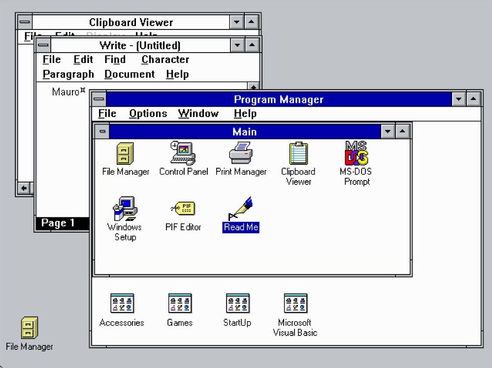
This update replaced the old “Program Manager” with a design that’s easier to use and more organized.
Back then, what we called a “Program Manager” was essentially just a disorganized list of programs – like a folder with subfolders, but lacking any real structure.
Interestingly, the Taskbar and Start button were first introduced at the same time as the Start menu, back with the release of Windows 95.
The menu was straightforward, featuring a drop-down list to open programs, files, and system options. A sidebar on the left prominently displayed the text “Windows 95”.
The “Programs” folder neatly organized your installed applications, allowing you to easily open them.
The “Documents” folder showed a list of files you’ve recently opened, making it easy to quickly find the ones you use most often.
The “Settings” folder let you open the Control Panel, where you could customize how your computer works. It also gave you quick access to settings for your printer and taskbar.
I also explored the Taskbar settings and found some limited options to customize the Start menu. While I could make a few changes, the level of control wasn’t extensive.
The “Find” feature let people search for files and folders on their computer. Unlike today, it didn’t search within the Start menu. Instead, it opened a separate “Find” application that was part of Windows 95.
The “Run” command let people start programs or open files simply by typing their name – a feature we still use today.
The “Shutdown” option provided a convenient way to turn off the computer.
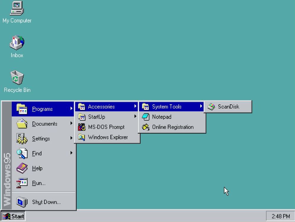
Windows 98: Refinement and expansion
The Windows 98 Start menu retained a similar look to the original, but it added a new “Log off” option to support its new ability to handle multiple users.
As part of my research, I’ve discovered that Microsoft also included a feature allowing users to check for and download Windows updates directly through Internet Explorer. Essentially, they integrated access to the Windows Update service within the browser.
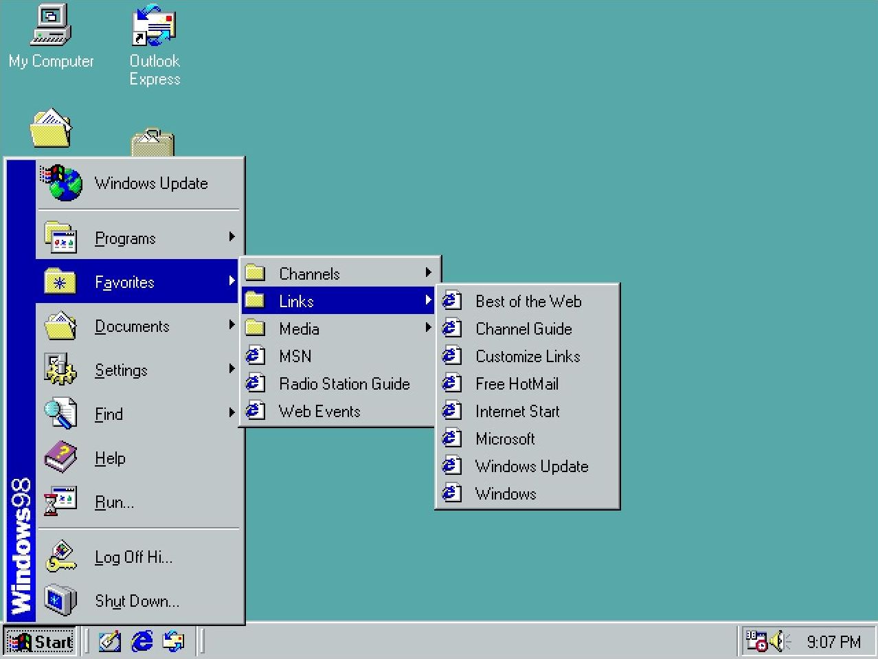
The Start menu also gained a “Favorites” section, which worked alongside Internet Explorer as a key part of the operating system.
Windows Me: Minor adjustments
In 2000, Microsoft released Windows Millennium Edition, but the Start menu remained largely unchanged from previous versions.
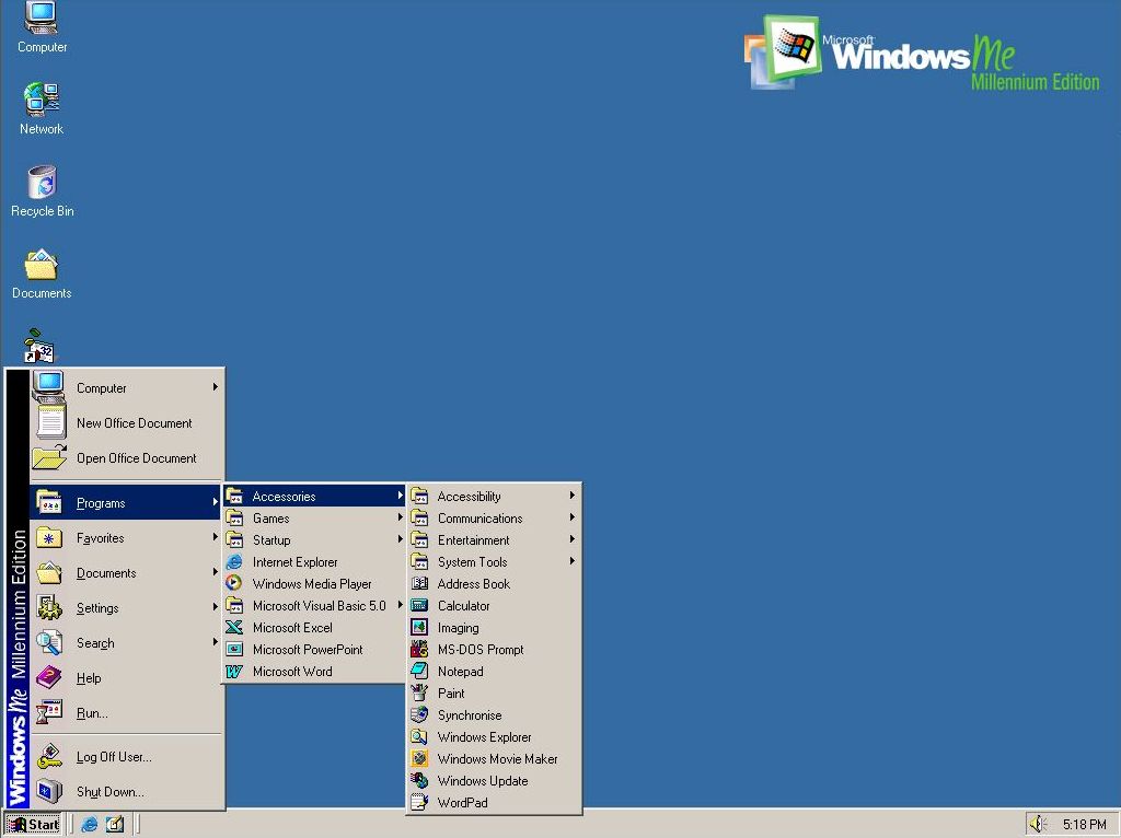
As a long-time tech fan, seeing the menu was a total throwback! It was *exactly* the same as what I remember from Windows 98. Honestly, the only thing that gave away it wasn’t actually 98 was the little branding on the side showing the name of this new OS.
This was the last time we had seen this version of this menu.
It’s important to note that the classic version of the menu was an option until Windows Vista.
Windows XP: A new era
Released in 2001, Windows XP introduced a fresh Start menu design. It split the menu into two sections: one side showed frequently used and pinned applications, and the other gave quick access to personal folders like Documents, Pictures, and Computer, as well as system settings.
This design aimed to streamline navigation and enhance productivity.
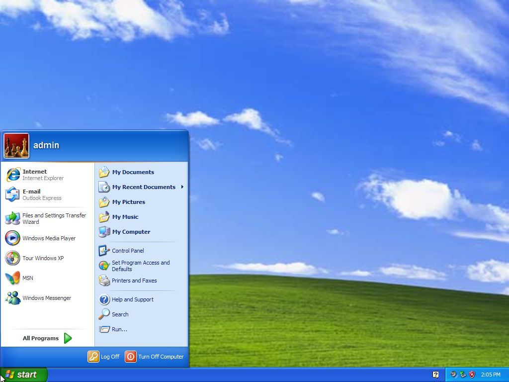
A profile picture appeared at the top of the left side, making the page feel more personal.
The column on the left side of the screen showed apps you use often, so they were easy to find. You could also pin your favorite apps there for even faster access.
The “All Programs” menu, found in the left-hand column, showed a list of every app installed on the computer, organized into categories.
The power button was helpfully placed at the bottom of the right side of the screen, so it was simple to shut down or restart the computer.
With Windows XP, Microsoft launched a new visual style called “Luna” that updated the Start menu. It featured a more modern design with rounded corners and brighter colors.
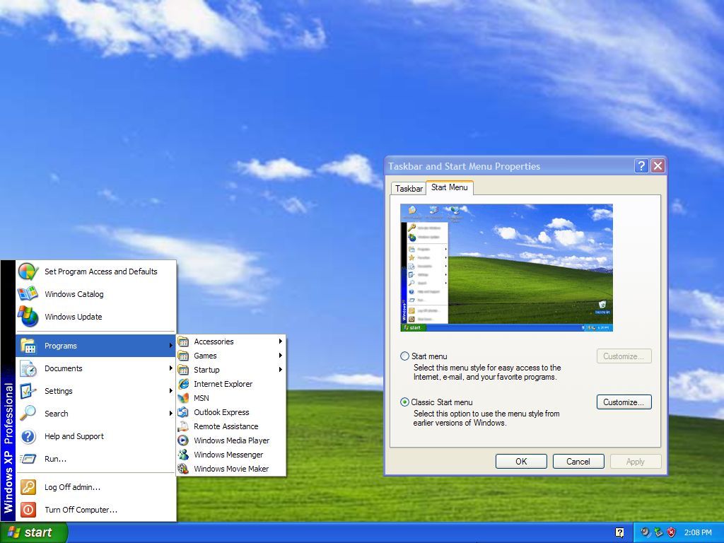
But the operating system also let users switch back to the older, familiar Start menu if they preferred a more traditional look and feel.
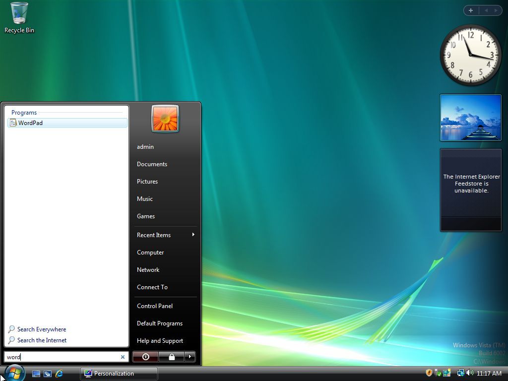
Windows Vista: Enhanced search and organization
Microsoft released Windows Vista in 2007. This update to the operating system featured a redesigned Start menu with built-in search, making it easier for users to find files and programs without leaving their current screen.
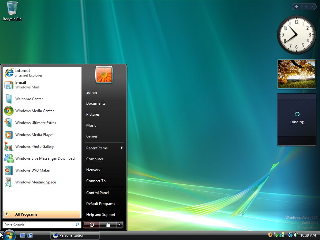
The new menu looked almost exactly like the one from Windows XP, with very similar design and features.
As a user, I really liked how the menu was organized. It had two main sections: on the left, it showed my most important and recently opened apps, which was super handy. Then, on the right, I could find all my personal folders and the system settings I needed. It just made everything easy to get to!
This update changed the location of the user account menu to the top-right corner. We also simplified some menu items by removing the word “My” – for example, “My Documents” is now just “Documents,” and “My Computer” is now “Computer.”
Windows 7: Just tweaks
Windows 7, released in 2009, featured a Start menu very similar to the one in Vista. It also introduced “Jump Lists,” which allowed users to quickly find recently used files and programs right from the Start menu.
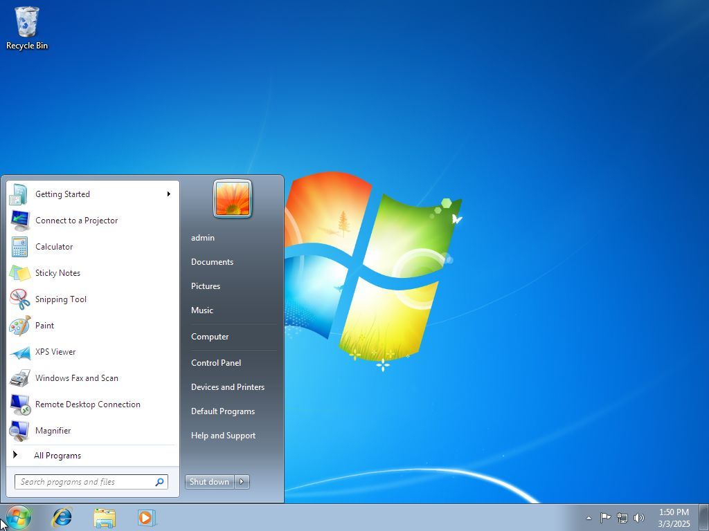
I noticed they reorganized the power options. The “Lock” feature is no longer a separate item; it’s now found within the “Shut down” menu. And it’s interesting – on Windows 7, you could actually customize what the power button *did*, which wasn’t possible in Vista.
With this update, Microsoft has also removed the option to use the older, classic Start menu.
Windows 8 and 8.1: A bold departure
In 2012, everything shifted for the company with the release of Windows 8. This new version completely replaced the familiar Start menu and button with a full-screen Start screen.
The change was intended to make things work the same whether you were using a touchscreen or a mouse and keyboard, but people had different reactions to it.
This is one of the biggest mistakes Microsoft made for the operating system.
Microsoft designed this full-screen feature to be central to how people would use its operating system with touchscreens.
The Start screen featured “Live Tiles” – visual shortcuts to apps and websites. These tiles weren’t just icons; they actively showed changing information, such as the latest weather, news, and social media updates.
Tiles also came in different sizes, letting people arrange them to fit their needs and highlight the most important information.
The Start screen also debuted a new design style, initially called “Metro” (and later “Modern”). This style featured simple, flat designs, large, clear fonts, and prioritized showing content over fancy visual effects.
A key issue was the Start screen’s design, which prioritized touchscreens with large, easy-to-tap tiles. The goal was to make things simple and consistent for anyone using a device with a touchscreen.
This update caused a lot of frustration for users, especially those on desktop computers who rely on a mouse and keyboard.
Because this operating system also lacked a Start button, Microsoft introduced the Charms bar. This was a sidebar that users could access by swiping in from the right edge of the screen or by moving their mouse to either the top or bottom right corner. The Charms bar provided quick access to frequently used features like search, settings, and the ability to share content.
The Windows 8 Start screen was a major change to how users interacted with their computers, focusing on touch controls and real-time updates. Although intended to be a modern improvement, many people disliked how different it was from the traditional desktop interface.
In 2013, Microsoft released Windows 8.1. While the classic Start menu didn’t return, they did bring back the Start button, which provided a link back to the Start Screen.
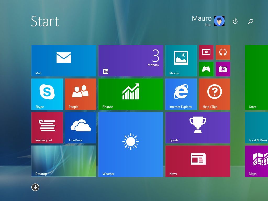
Windows 10: Merging legacy and modern design
Released in 2015, Windows 10 reintroduced the Start menu, blending its familiar, traditional layout with dynamic, customizable tiles. This design offered a similar experience to users of Windows 7 and Vista.
As a tech fan, I really liked how they tried to bridge the gap between classic desktop users and those who prefer touchscreens. They did this by keeping things familiar with a standard menu on the left, but then adding a more modern, tile-based interface on the right – a nice balance of old and new, if you ask me.
The left side of the screen showed a list of all your apps in alphabetical order, so you could quickly find what you were looking for.
The sidebar on the left lets you manage your profile settings and quickly open common folders like Documents, Pictures, File Explorer, and Settings. You can also find power options there – like shutting down, restarting, or putting the computer to sleep.
The right side of the screen showed Live Tiles, which let people pin their favorite apps and see information update automatically.
You could customize the Live Tiles in the Start menu by changing their size, moving them around, and grouping them together. You also had the option to show or hide individual tiles, letting you choose what information was visible.
Windows 10 responded to complaints about Windows 8 by reintroducing the classic Start menu. Its design combined the best of both worlds – traditional menu navigation and the modern, tile-based interface.
This version gave me the most control over how the Start menu looked and worked that I’ve ever experienced in this operating system. You could even choose to display the Start menu across the entire screen.
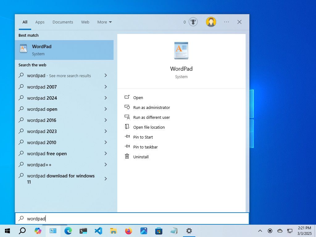
Starting with Windows 10, Microsoft made searching your computer separate from the Start menu. While you can still search *from* the Start menu, Windows Search also has its own dedicated space on the taskbar and home screen. This setup remains the same in Windows 11.
On Windows 7 and Vista, the search occurred within the Start menu experience.
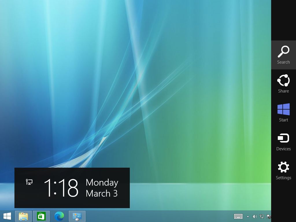
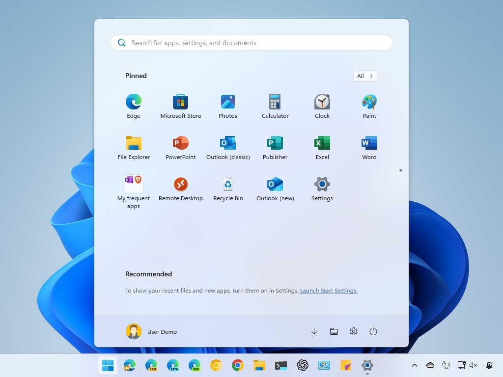
Windows 11: A centered and simplified design
Microsoft released Windows 11 in 2021, featuring a redesigned Start menu and a centered Taskbar. These changes gave the operating system a fresh new look and have received a variety of responses from users.
Windows 11 features a fresh, more modern design, most notably with the Start button and Taskbar icons now positioned in the center of the screen.
The new Start button location has been a point of discussion, since it’s different from the usual left-side placement. Because of this, many users immediately change it back to the left when they first set up their system.
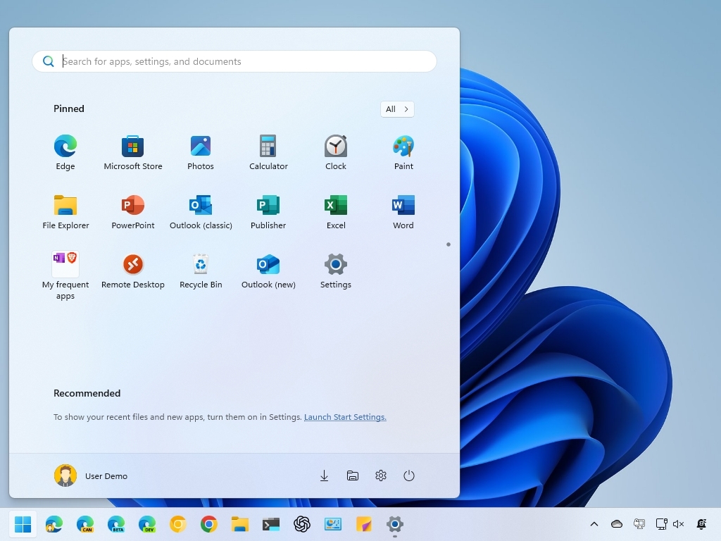
The Start menu has a cleaner design now. It shows your pinned apps at the top, and below that, a “Recommended” section displays files and apps you’ve used recently.
The dynamic Live Tiles are now standard icons, and the overall menu design features rounded corners and a simpler, more streamlined look.
The menu lets you pin unlimited apps and arrange them into scrollable pages and groups. However, some users who are used to the Windows 10 Start menu have said they miss having more ways to customize it.
Many users feel this version offers fewer ways to personalize the experience than older versions. Specifically, you can’t change the size of the menu, get rid of the “Recommended” section, or use Live Tiles.
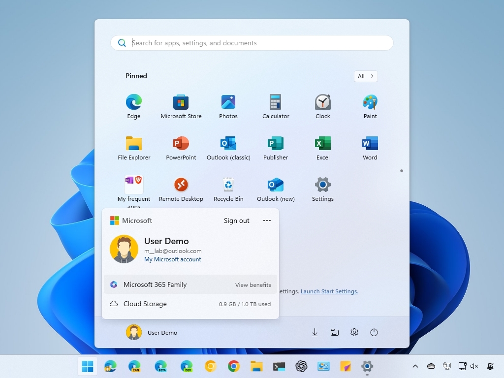
The Start menu in Windows 11 now includes more advertisements. While Microsoft has always suggested apps from partners, this was previously limited to new Windows installations. Now, the “Recommended” section actively promotes apps available in the Microsoft Store.
The company also uses the user menu to advertise its cloud services, encouraging people to save their files to OneDrive and sign up for Microsoft 365.
This menu is different from the older ones because it’s laid out horizontally, instead of vertically.
Start menu overhaul
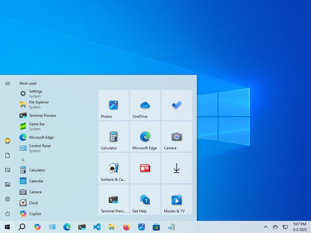
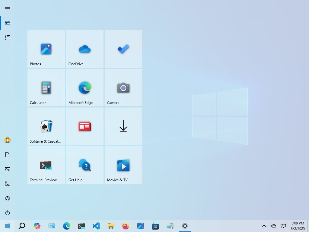
Beginning with the November 2025 security update, we’re releasing an updated Start menu. It builds on the familiar Windows 11 Start menu design, but includes some new improvements.
The updated Start menu is bigger and automatically adjusts to your screen size, but unfortunately, you can’t change its size manually.
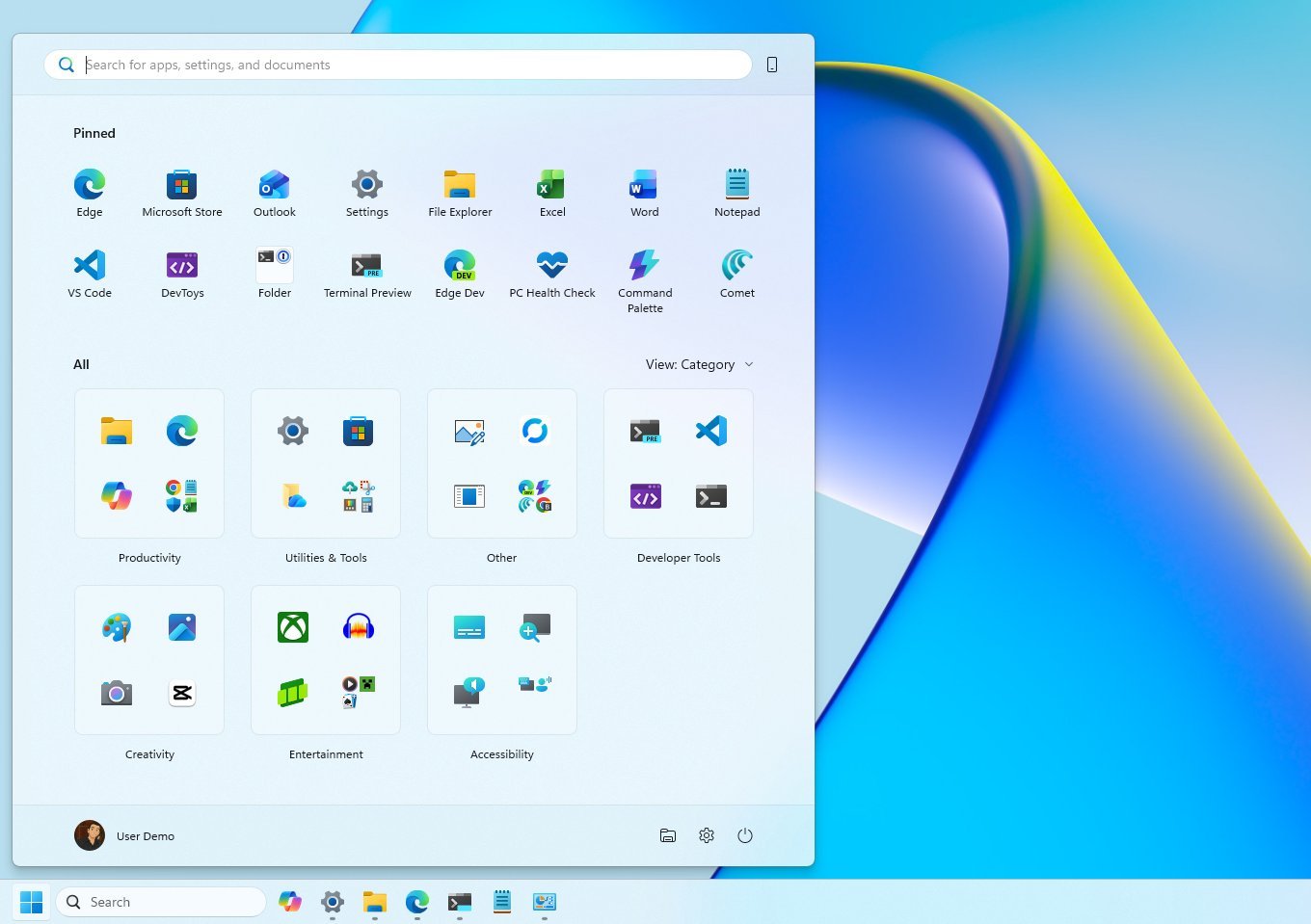
The updated design simplifies things by offering a single, unified experience broken down into three clear sections: Pinned, Recommended, and All.
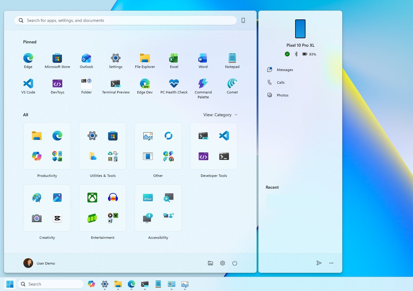
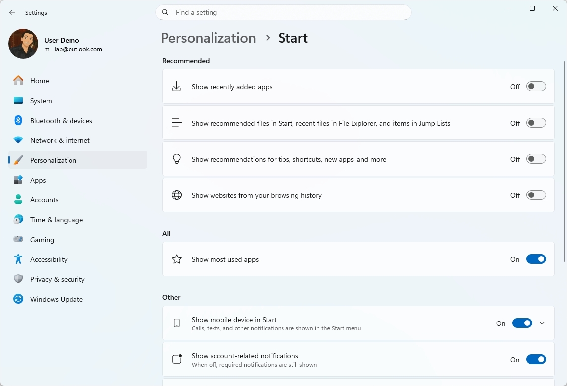
If you connect your phone to your computer with the Phone Link feature, you’ll see an extra mobile sidebar in the Start menu. You can easily hide or show this sidebar with a switch at the top-right corner.
The “Pinned” section normally displays apps in two rows, and the wider layout allows each row to fit up to eight apps.
The “Recommended” area now shows up to six apps and files that you might like. The biggest update, though, is that you can now turn this section off if you don’t want to see it.
You can achieve this on the “Start” settings page by disabling all options within the “Recommended” section.
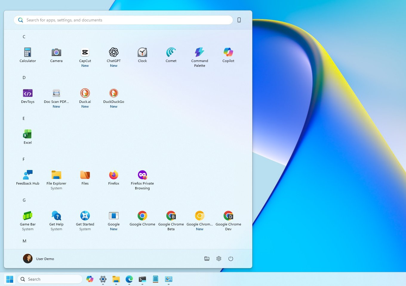
Microsoft is also making the “All” menu more prominent by moving it to the front. They’ve also updated how apps are displayed, with the default view now organizing them into folders based on category. This happens automatically – if the system finds at least three apps of the same type, it creates a new folder for them. Otherwise, those apps will be listed in the “Other” section.
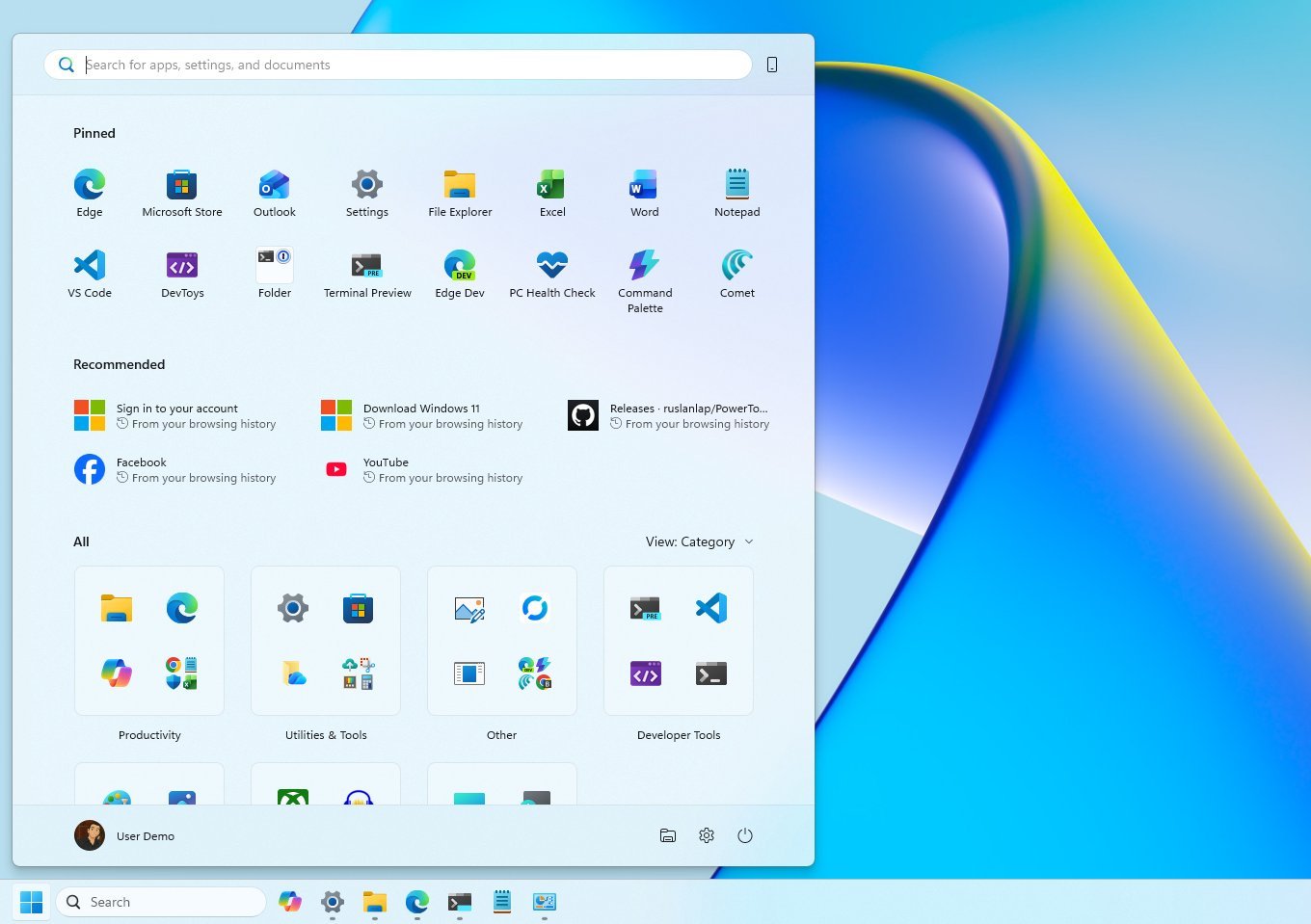
You can still use the older view by selecting the “Name list” option. The “Name grid” displays apps in a row-based layout.
While the Windows 11 Start menu isn’t as customizable as previous versions, it still includes features you’re used to, like the search bar, your account settings, power controls, folders, and a complete list of all your apps.
Microsoft’s Start Menu has changed a lot over time as the company has worked to keep up with what users want and how technology is improving. While they’ve always been trying to adapt, some changes haven’t quite hit the mark.
More resources
Read More
- What Song Is In The New Supergirl Trailer (& What It Means For The DC Movie)
- Highly Anticipated Strategy RPG Finally Sets Release Date (And It’s Soon)
- TV legend Carol Kirkwood reveals the reasons why she decided to retire after 28 years with BBC
- The Super Mario Galaxy Movie: 50 Easter Eggs, References & Major Cameos Explained
- Welcome to Demon School! Iruma-kun season 4 release schedule: When are new episodes on Crunchyroll?
- Dune 3 Gets the Huge Update Fans Have Been Waiting For
- Why is Tech Jacket gender-swapped in Invincible season 4 and who voices her?
- Sydney Sweeney’s The Housemaid 2 Sets Streaming Release Date
- MOUSE: P.I. For Hire Loops in Caravan Palace for A Catchy New Track Ahead of April 16 Release
- PEAK ‘PLAY IT YOUR WAY’ update now available
2025-11-23 22:44