Marvel Studios has released a bold, R-rated poster for its upcoming animated series, Marvel Zombies, hinting at a darker direction for the Marvel Cinematic Universe. The series, debuting on Disney+ on September 24, 2025, represents a continued effort by Marvel to explore more mature themes and storytelling. This poster is a clear sign of Marvel expanding beyond its typical family-friendly content.
Viewers are impressed with how much better Marvel Zombies looks compared to What If…?, especially with the animation. The show’s overall style is really grabbing people’s attention, and a recently released poster is being called some of Marvel’s best R-rated artwork yet. Marvel Zombies is part of a growing number of mature-rated projects from Marvel Studios, alongside series like Echo and Daredevil: Born Again, and the upcoming Deadpool & Wolverine, which is already expected to be a big hit with mature audiences.
I’m really excited for Marvel Zombies! It’s going to be a dark and intense four-episode series, definitely not for the faint of heart. It’s continuing the story from that awesome zombie episode in Season 1 of What If…?, and taking us even further into that alternate universe. The new trailer showed so many familiar faces – Shang-Chi, Yelena, Spider-Man, Blade, Scarlet Witch, and a ton of others! I can’t wait to see how it all plays out.
Top 5 Best R-Rated MCU Posters
Marvel Zombies (Wanda)
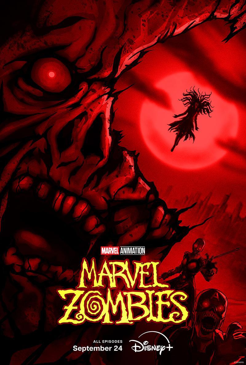
The poster for the new *Marvel Zombies* is arguably Marvel Studios’ most impressive R-rated image so far, offering a chillingly creative spin on familiar faces from the Marvel Cinematic Universe.
Okay, let me tell you, the first thing that hits you about this poster is the color – it’s drenched in this really striking, almost overwhelming blood-red. It instantly creates a dark, unsettling mood. Your eye is immediately drawn to this horrifying zombie head, and then, cleverly, you realize it’s framing Scarlet Witch. She’s *inside* the head, floating in the empty space. A closer look reveals the details – her messy, torn hair, those intensely glowing eyes, and her completely ruined dress. It all adds up to this really powerful, and frankly creepy, image of a queen ruling over the dead. It’s a fantastic visual – unsettling, but captivating.
Below and to the right of her, we see zombie versions of Okoye and Captain America, emphasizing how dangerous the situation is and suggesting some truly brutal fights are ahead.
This poster cleverly mixes scary visuals with the character-driven storytelling Marvel is known for. It hints at a huge, villainous journey for Scarlet Witch and feels more mature than past marketing for Marvel’s R-rated projects.
Deadpool & Wolverine (Thailand)
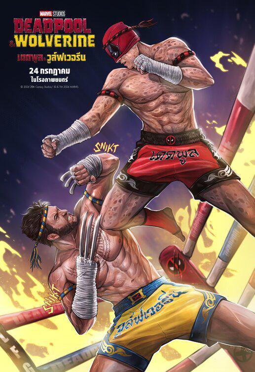
The Thailand poster for *Deadpool & Wolverine* was a particularly impressive piece of international marketing. It skillfully combined humor, striking visuals, and a sense of grand scale, effectively reflecting the film’s blockbuster status.
The artwork shows Deadpool (played by Ryan Reynolds, and expected to appear in *Avengers: Doomsday*) and Hugh Jackman’s Wolverine in a fighting pose, inspired by Muay Thai. Both characters are depicted shirtless, with battle scars, and prepared to fight in a ring engulfed in flames.
Deadpool’s costume has subtle nods to Iron Fist, and Wolverine’s claws are poised for action. This gives the overall look a dynamic, cartoonish feel that’s both fun and powerful.
Echo (American Sign Language)
A particularly effective marketing move for the show *Echo* was Marvel Studios’ ASL poster, which creatively displayed the title using only sign language.
The design was both simple and powerful, celebrating Maya Lopez’s identity as a deaf superhero and offering a genuinely creative and respectful portrayal of representation.
People loved the poster because it was a fresh departure from Marvel’s usual style, opting for an elegant design that felt deeply connected to the character’s background.
Kira Kelly, the cinematographer, explained to TopMob that a major difficulty while filming the series was figuring out how to capture close-ups effectively when filming American Sign Language. They had to rethink what a close-up even *was* in that context.
Deadpool & Wolverine (Beauty and the Beast)
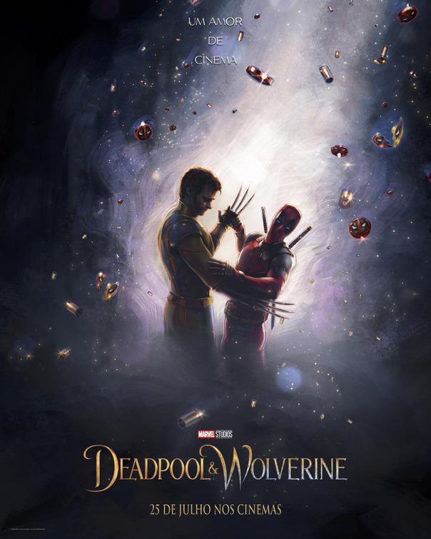
Roughly a month before the release of *Deadpool & Wolverine*, Ryan Reynolds shared a funny poster referencing *Beauty and the Beast*. He did this as a lighthearted nod to the fact that this was the first *Deadpool* movie to be made under Disney’s ownership.
The artwork, titled “Un amor de cinema” (meaning “A love of cinema”), playfully depicts Deadpool and Wolverine dancing amongst floating bullets and sparkling charms. This combines romance and the franchise’s well-known humor. This kind of engaging promotion is a key reason why *Deadpool & Wolverine* has earned $1.3 billion worldwide.
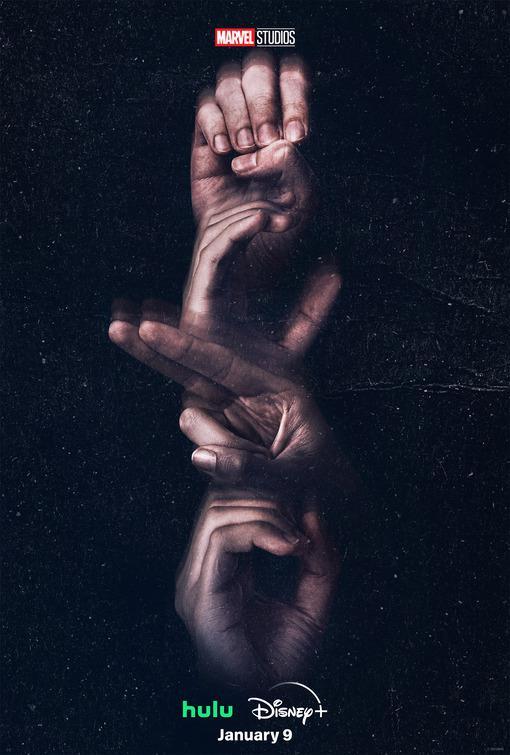
Daredevil: Born Again (Matt Murdock/Daredevil)
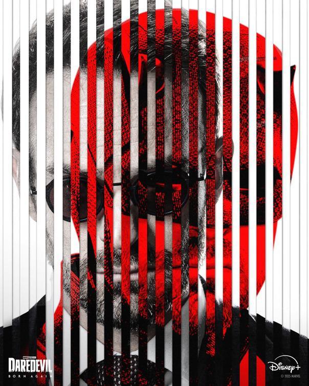
The new poster for Marvel’s *Daredevil: Born Again*, coming to Disney+ in 2025, features a bold design using red, white, and black. It cleverly combines images of Matt Murdock and his superhero alter ego, Daredevil, to represent the two sides of his personality.
The design beautifully captures the story of Season 1, showing Matt’s journey to get the mask back after losing Foggy, and reminding us that both Matt Murdock and his alter ego, the Devil of Hell’s Kitchen, are vital to achieving justice.
After the season’s wild ending, Season 2 will do something new for the Marvel Cinematic Universe: it will start right where Season 1 left off. The story will continue to follow Matt’s battle with Kingpin in a New York City that’s under military control.
Read More
- Everything You Need To Know About Nikki Baxter In Stranger Things’ Animated Spinoff
- The Boys Season 5, Episode 5 Ending Explained: Why Homelander Does THAT
- Taylor Sheridan’s Gritty 5-Part Crime Show Reveals New Final Season Villain
- Mark Zuckerberg & Wife Priscilla Chan Make Surprise Debut at Met Gala
- Miranda Kerr Shares “Quick” Procedure She Got Before Met Gala 2026
- From season 4 release schedule: When is episode 2 out on MGM+?
- Welcome to Demon School! Iruma-kun season 4 release schedule: When are new episodes on Crunchyroll?
- Why There’s No Ghosts Tonight (Nov 27) & When Season 5, Episode 7 Releases
- How to Build Water Elevators and Fountains in Enshrouded
- ‘The Bride!’ Review: Jessie Buckley Breathes Life into a Monstrous Mess
2025-09-23 08:06