
Tony Stark is incredibly intelligent, but even he makes odd choices sometimes. Iron Man initially built his armor out of necessity – it started as a life-saving device. But it quickly evolved into a showcase of his engineering skills and his own confidence. What began as a simple need soon became a constant drive to innovate, which is both his biggest asset and his most noticeable flaw. He just can’t stop improving things, even when those improvements aren’t always successful.
The Hall of Armor isn’t just filled with the amazing technology that’s saved the world many times over – it also holds some seriously questionable designs best left in the past. Things like the strange ‘nose armor’ from the 1970s, which gave his helmet an odd, protruding nose, and a suit with roller skates that made him look like a high-tech disco dancer, show that Tony Stark’s ideas didn’t always work out. Sometimes, his experiments actually hurt his reputation for being sleek and sophisticated.
10. Arctic Armor

The Arctic Armor, first appearing in *Iron Man #318* (1995), is Tony Stark’s suit designed for cold weather. However, given that his standard armor already handles flight, heat, and heavy weaponry, adding a cold-weather paint job feels a bit redundant. While the silver and white coloring provides some camouflage in the snow, that advantage is lost as soon as he uses his repulsors or rockets. The Arctic Armor does work in the cold, but it often seems more like Tony Stark dressing up as a powerful, high-tech refrigerator.
9. The Gold Armor

After his initial, clunky gray suit, Iron Man received a significant upgrade with the Gold Armor. Tony Stark intentionally chose a bright gold color to create a more inspiring and heroic public image. However, while the color change helped establish Iron Man’s iconic look, the armor’s design itself was fairly basic and lacked the refinement of his future suits. It appeared cumbersome and awkward, almost like a toy. Even from a practical standpoint within the story, the shiny, reflective surface would have been a disadvantage, interfering with sensors and giving away his location.
8. Thorbuster Armor
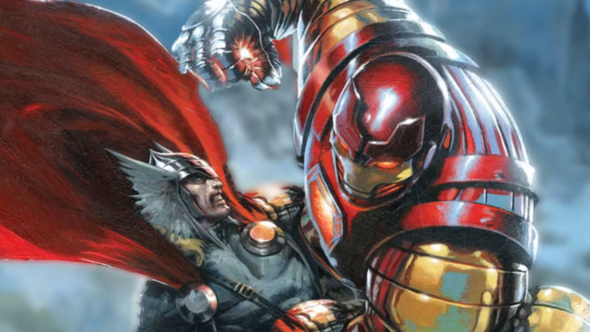
The idea of a suit built to fight Thor is incredibly cool. The Thorbuster armor was meant to be powered by Asgardian energy, but it ended up looking more like a cheap imitation of medieval armor. In *Iron Man (Vol. 3) #64*, Tony Stark used the armor to try and stop Thor, who had become almost invincible after gaining the Odinforce. But when they fought, the Thorbuster armor was put to the test and ultimately failed. Despite its promising design and purpose, the armor couldn’t handle Thor’s full power for very long. All the effort, money, and broken trust ultimately led to a suit that couldn’t even withstand a slightly irritated Thor.
7. Mark 52 Hulkbuster Car

Iron Man has already mastered the idea of quickly accessing armor with solutions like remotely summoned suits, portable cases, and satellite systems. While a transforming car is cool, it feels unnecessarily complex for Tony Stark. He’s built to fly, so converting a car’s parts into armor seems more like a fun gimmick than a genuine upgrade. It’s not a bad idea, but ultimately, the concept feels a bit unnecessary.
6. Silver Centurion Armor

The Silver Centurion armor first appeared in *Iron Man #200* (1985), marking Tony Stark’s return after battling alcoholism. It was a powerful statement – Tony was back as Iron Man, taking the role from James Rhodes, who had been temporarily filling in, and finally defeating his longtime enemy, Obadiah Stane. Opinions on the suit are divided; some fans appreciate it, while others dislike its bright red and silver design, finding it looks more festive than functional. The large shoulder pads also draw criticism.
5. Iron Lantern Armor

The Iron Lantern first appeared in 1997 as part of a unique comic book event called Amalgam Comics, which combined characters from Marvel and DC into strange new combinations. This character was created by merging Iron Man and Green Lantern. It’s a product of its time – a typical example of the over-the-top style of 1990s comics. The concept takes a hero with limitless creation abilities and puts them in heavy, cumbersome armor, overshadowing Iron Man’s clever design with flashy, light-based effects. The result is a complicated and unnecessary character – it tries to be both things at once, but doesn’t fully succeed at either.
4. Hydro Armor

Iron Man’s Hydro armor looks more like a villain from *Power Rangers* than a serious superhero suit. First appearing in *Iron Man #218* (1987), it was designed to help Tony Stark fight underwater threats. However, creating a whole new suit just for underwater missions feels like overkill, even for someone as prepared as Tony Stark. The Hydro armor is a good example of one of Tony’s ideas that doesn’t quite live up to his usual standards and probably shouldn’t be featured in his Hall of Armors.
3. Stealth Armor

The Stealth Armor first appeared in *Iron Man #152*. While Tony Stark’s suits usually focus on strength and protection, this one was built for sneaking around and avoiding detection. However, simply painting the armor black and labeling it “stealth” doesn’t hide the fact that it’s still a large, six-foot-tall metal suit with rockets. Instead of seeming smart or original, it feels like Tony Stark is forcing his technology to work in a situation it wasn’t meant for.
2. Roller Skates Armor

The idea of Iron Man with roller skates built into his armor is a wonderfully strange concept straight out of comic books. Appearing in issues like *Tales of Suspense #45* and *Secret Wars #3*, the skates were intended to give Iron Man more ground mobility. Some storylines even suggested they could help power the suit, which is a clever idea, but ultimately feels a bit pointless. It seems like a solution to a problem Tony Stark didn’t really have, and while it’s a fun piece of comic book history, it’s hard to imagine it being taken seriously. Seeing a brilliant billionaire superhero like Tony Stark rolling around on roller skates is just…not cool.
1. Nose Armor

The often-ridiculed “Nose Armor” first appeared in *Iron Man #68* (1974). Marvel editors felt Iron Man’s mask looked too flat and decided a realistic helmet should have space for a nose. This led to a redesign featuring a prominent nose indentation. However, fans immediately disliked it, and its quick removal from the comics confirms it was a design mistake. While a minor detail in Iron Man‘s history, it’s become famous for being a particularly unpopular change.
Read More
- What Song Is In The New Supergirl Trailer (& What It Means For The DC Movie)
- Why is Tech Jacket gender-swapped in Invincible season 4 and who voices her?
- The Super Mario Galaxy Movie: 50 Easter Eggs, References & Major Cameos Explained
- Sydney Sweeney’s The Housemaid 2 Sets Streaming Release Date
- Welcome to Demon School! Iruma-kun season 4 release schedule: When are new episodes on Crunchyroll?
- Highly Anticipated Strategy RPG Finally Sets Release Date (And It’s Soon)
- Dune 3 Gets the Huge Update Fans Have Been Waiting For
- TV legend Carol Kirkwood reveals the reasons why she decided to retire after 28 years with BBC
- Fleetwood Mac’s Lindsey Buckingham Attacked With Unknown Substance
- We Need More Open World Games to Feature This Genre
2025-09-17 22:12