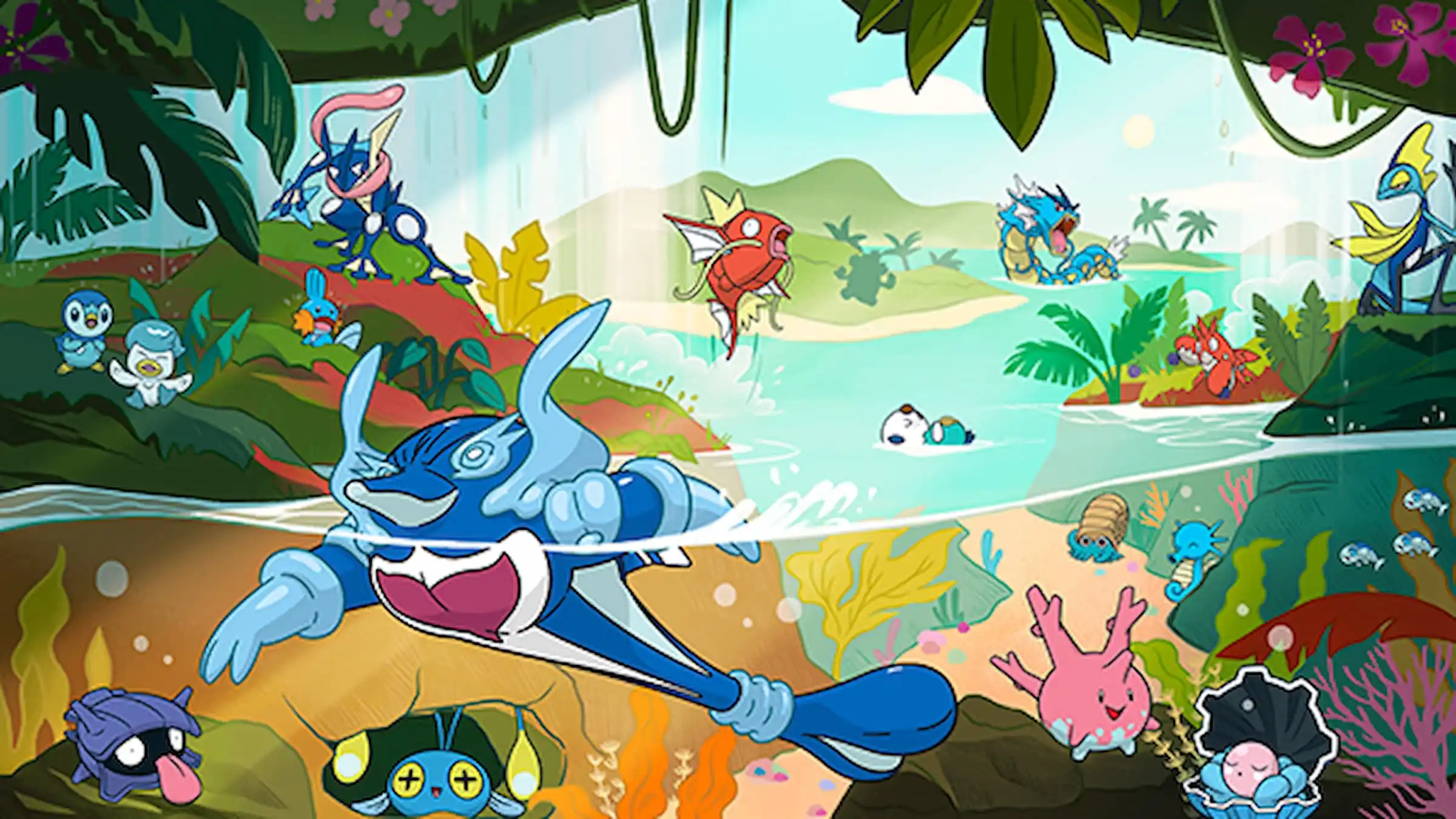
Water-types have always been a huge part of Pokemon, ever since the very first games, Red and Blue. You usually find them hanging out in oceans, rivers, and even way down deep underwater. With the hints about Pokemon Winds and Waves, I’m expecting a lot of focus on water areas, which hopefully means some awesome new Water-type Pokemon. Honestly, Pokemon has done a great job with fish, whales, and crabs and stuff over the years. But, I gotta say, sometimes Game Freak’s designs for Water-types just haven’t hit the mark.
Throughout the Pokémon series, games like Gold & Silver, Black & White, and Scarlet & Violet have featured many different Water-type Pokémon. Some of these designs are beautiful and clearly inspired by aquatic creatures, while others don’t quite capture the essence of water or are simply unappealing. Judging by their appearance alone, it’s clear which Pokémon truly feel like they belong in the water and which ones don’t. Here are five of the best and worst Water-type Pokémon designs from across the games.
5) Worst Designed Water-Type Pokemon – Simipour
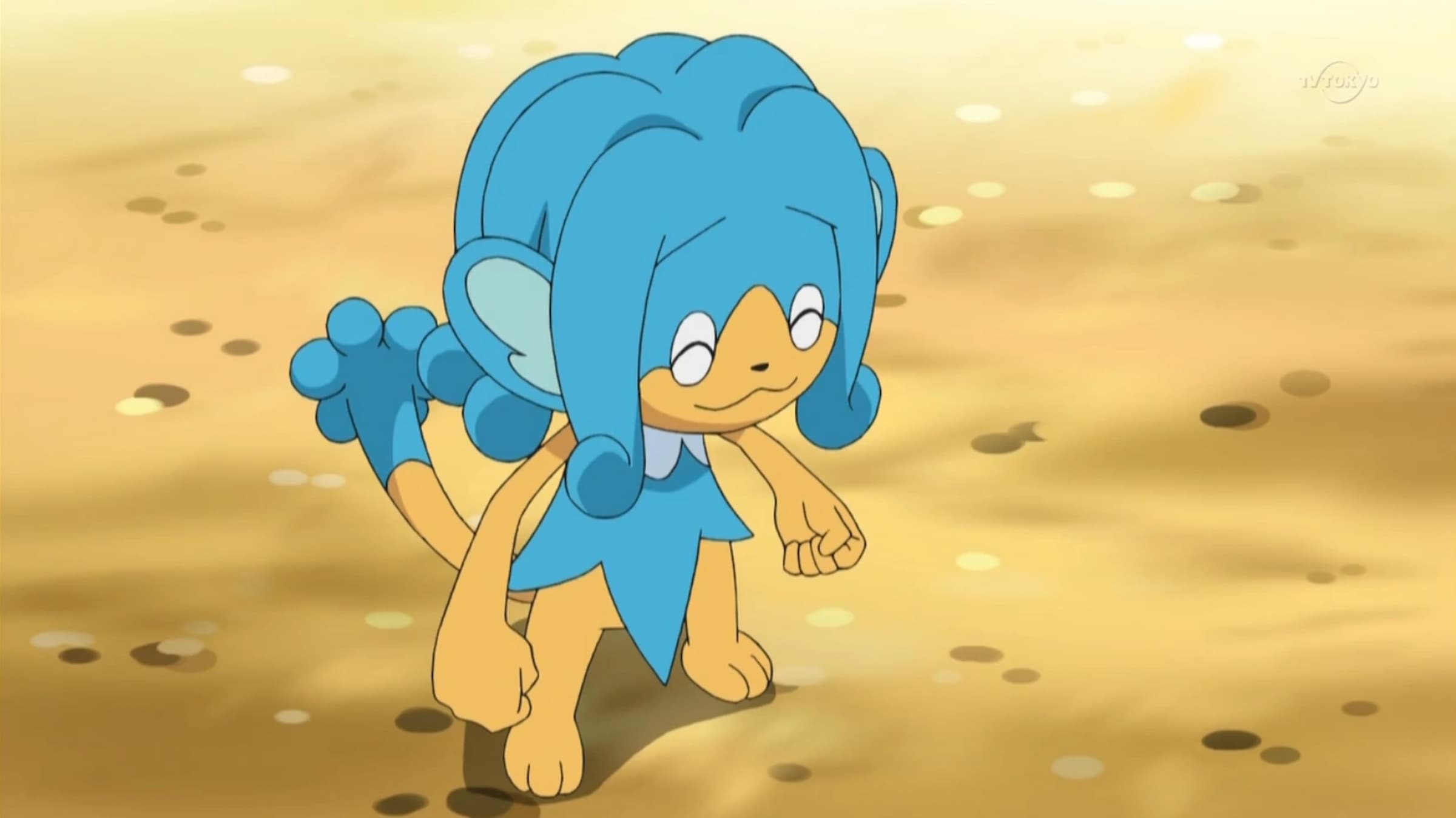
Simipour first appeared in the Pokemon Black and White games as one of three monkeys, each representing a different starter Pokemon type through its appearance and attacks. Although the concept was straightforward, Simipour’s design, and those of its fellow monkeys, aren’t as strong when considered solely as Water-type Pokemon and compared to other Pokemon of that type.
Simipour’s most noticeable feature is its large, fountain-like hair, which was intended to look like flowing water. However, the style is so exaggerated that it appears more like cartoon hair than something naturally aquatic. Aside from this, Simipour looks like a regular monkey with little to suggest it lives in or near water. Its design feels like a typical mammal that’s simply been given a water-themed makeover, rather than a creature actually shaped by its watery habitat.
5) Best Designed Water-Type Pokemon – Araquanid

I always thought Araquanid, which first showed up in Pokemon Sun and Moon, was such a clever design! It looks like a spider carrying a big bubble of water on its head, and that bubble isn’t just for show. It actually protects Araquanid and helps it catch prey. Apparently, it’s based on a real spider called the diving bell spider, which is so cool! It’s a fantastic mix of real science and Pokemon fantasy, and that’s what makes Araquanid really stand out from other Water-types, in my opinion.
Diving spiders naturally create air bubbles underwater to help them breathe, and the Pokémon Araquanid takes this concept to the extreme by forming a huge bubble that acts like a diving helmet. This design makes Araquanid feel like a natural fit in the Pokémon world, while still being visually distinct. The Water and Bug type combination is also a welcome return, as it hadn’t been used since Surskit evolved. Bringing it back in the island region of Pokémon Sun and Moon makes Araquanid’s introduction even more significant.
4) Worst Designed Water-Type Pokemon – Barbaracle
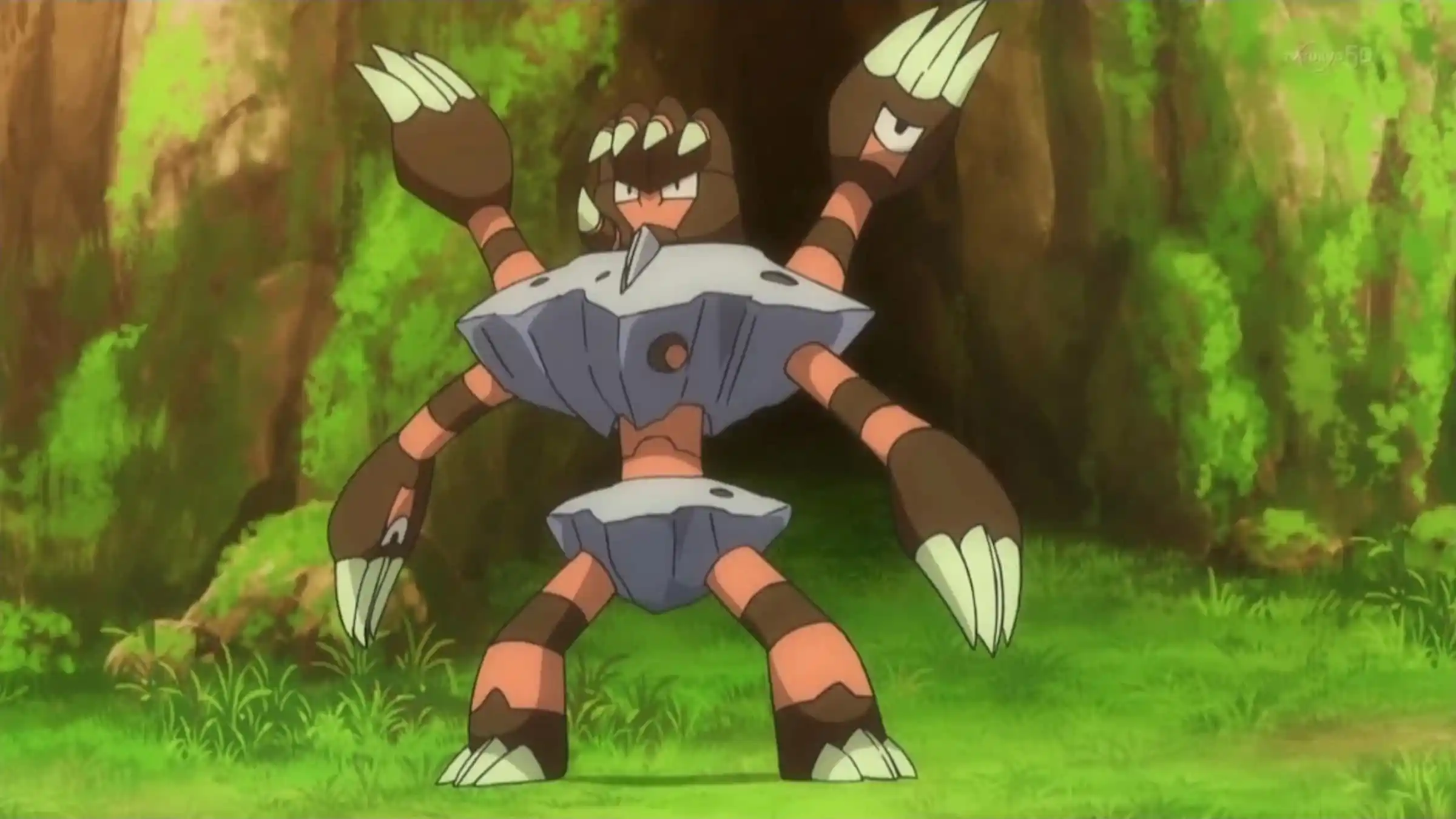
Barbaracle debuted in Pokémon X and Y and was designed with barnacles in mind. While the ocean inspiration is clear, the final result feels overly busy and hard to understand. It’s made up of several hand-like heads growing out of a rocky base, and each one has its own face, which makes the overall look chaotic and unsettling. Though barnacles are unusual creatures, Barbaracle’s exaggerated features make it difficult to quickly grasp what you’re looking at.
As a Water-type fan, I always felt a little let down by Barbaracle’s design. It just looks… rocky! Honestly, it feels more like a living rock than a Pokémon shaped by the sea. You can see the marine inspiration is there, but it’s buried under so much visual detail that the water theme gets lost. If Game Freak had simplified things and leaned more into water-based elements, I think Barbaracle would have been way more popular with fans. It really could have been a fantastic design with a few tweaks!
4) Best Designed Water-Type Pokemon – Finizen
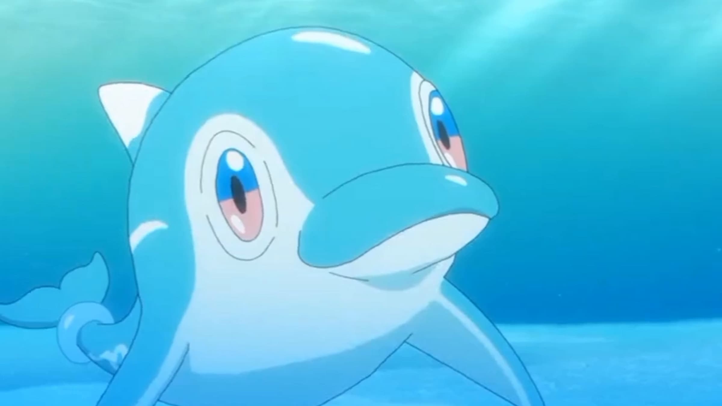
Finizen, a Pokémon first appearing in Scarlet and Violet, proves that a simple design can be very effective. It looks like a cheerful, streamlined dolphin with smooth, flowing lines. There are no unnecessary complexities or strange features—it’s exactly what fans hoped for in a dolphin Pokémon. The design focuses on shapes that clearly convey speed and the feeling of swimming through water.
The design’s clean, streamlined shape is a major strength. Finizen feels like a natural fit within the Pokemon universe because it isn’t cluttered with unnecessary details. It perfectly embodies the feel of an ocean creature while still maintaining the series’ signature style. Its simplicity gives it a classic, almost Generation 1, vibe. This Pokemon is a dream come true for dolphin fans, and a powerful evolution would have made it one of the most visually appealing Water-type evolution lines.
3) Worst Designed Water-Type Pokemon – Inteleon
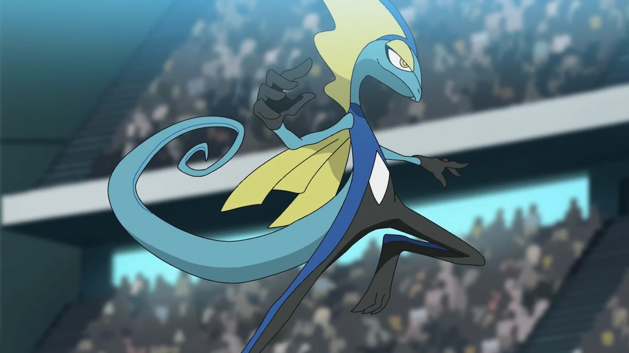
Inteleon, the fully evolved form of the Water-type starter Pokémon in Sword and Shield, breaks from typical Water Pokémon designs. Instead of looking like a traditional aquatic creature, it’s designed to resemble a sleek, upright lizard inspired by a spy or secret agent. Its design focuses on personality – it uses finger guns and strikes dramatic poses – but this emphasis on style actually diminishes its connection to the Water element. Inteleon’s body and posture make it look more like a cartoon spy than a Pokémon adapted for life in the water.
Inteleon unfortunately follows a pattern of Pokemon starters becoming overly human-like in design. Although the spy theme fits well, it overshadows the designs of its earlier forms. Combined with a noticeable lack of water-based features, Inteleon feels like a missed opportunity for a compelling Water-type Pokemon and could really benefit from a redesign, though that’s unlikely to happen.
3) Best Designed Water-Type Pokemon – Blastoise
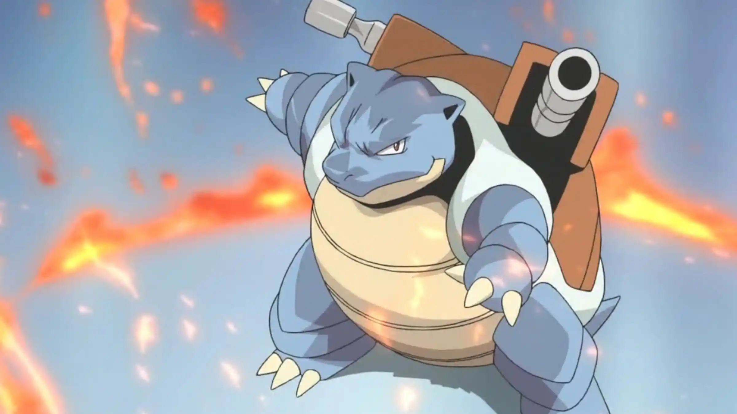
Blastoise first appeared in the original Pokemon Red and Blue games and soon became one of the most famous Water-type Pokemon. It’s designed like a huge turtle with strong water cannons built onto its shell. These cannons clearly show its water power, visually representing moves like Hydro Pump with powerful bursts of water. The turtle design makes it feel like a strong, mobile fortress built for aquatic battles.
Blastoise’s shell enhances its water-based design, as turtles are naturally linked to water. It strikes a good balance between a realistic look and fantastical elements, resulting in a powerful design that still feels connected to marine life. This simple yet elegant design makes Blastoise an ideal representation of Water-type Pokémon, and it also complements the appearances of its earlier forms and the overall style of the first generation of Pokémon.
2) Worst Designed Water-Type Pokemon – Bruxish
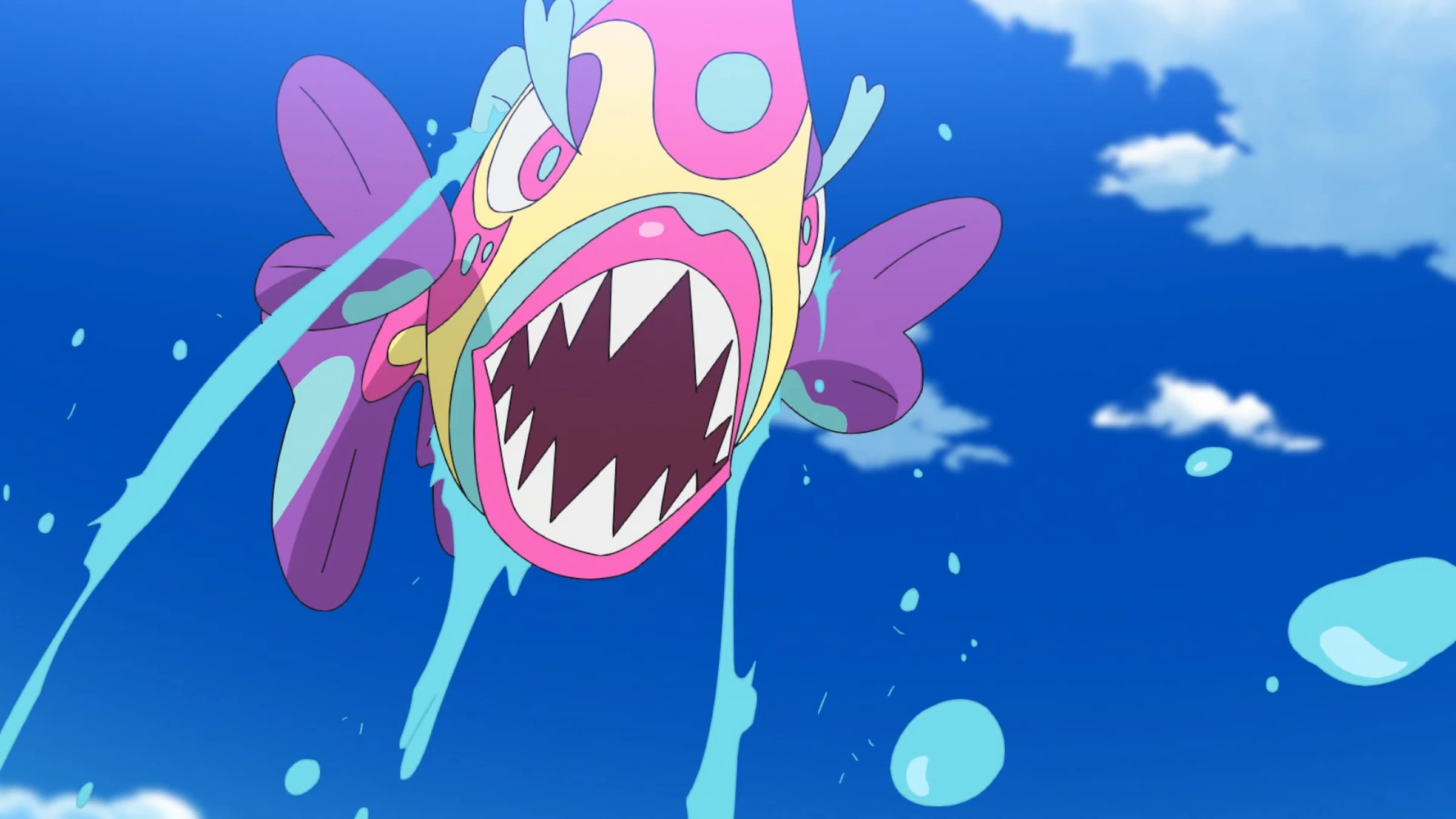
Bruxish first appeared in the Pokemon Sun and Moon games and quickly became noticeable for its incredibly bright colors and over-the-top design. It’s clearly inspired by colorful reef fish, but its appearance is much more extreme. Many people find Bruxish unattractive. Its big lips and pointy teeth create a bizarre look that overshadows its connection to ocean life. While real reef fish can be strange-looking, Bruxish has a wild expression that some find disturbing.
Okay, so as someone who loves Water-types, I get that Bruxish tries to look like a fish, and that part works. But honestly, the bright colors and its face are just… a lot. It feels less like a graceful reef fish and more like a goofy cartoon. They really overdid it with the weird expression; it would’ve been so much better if they’d focused on making it look more realistically fish-like and elegant, like a lot of other Water Pokemon.
2)Best Designed Water-Type Pokemon – Vaporeon
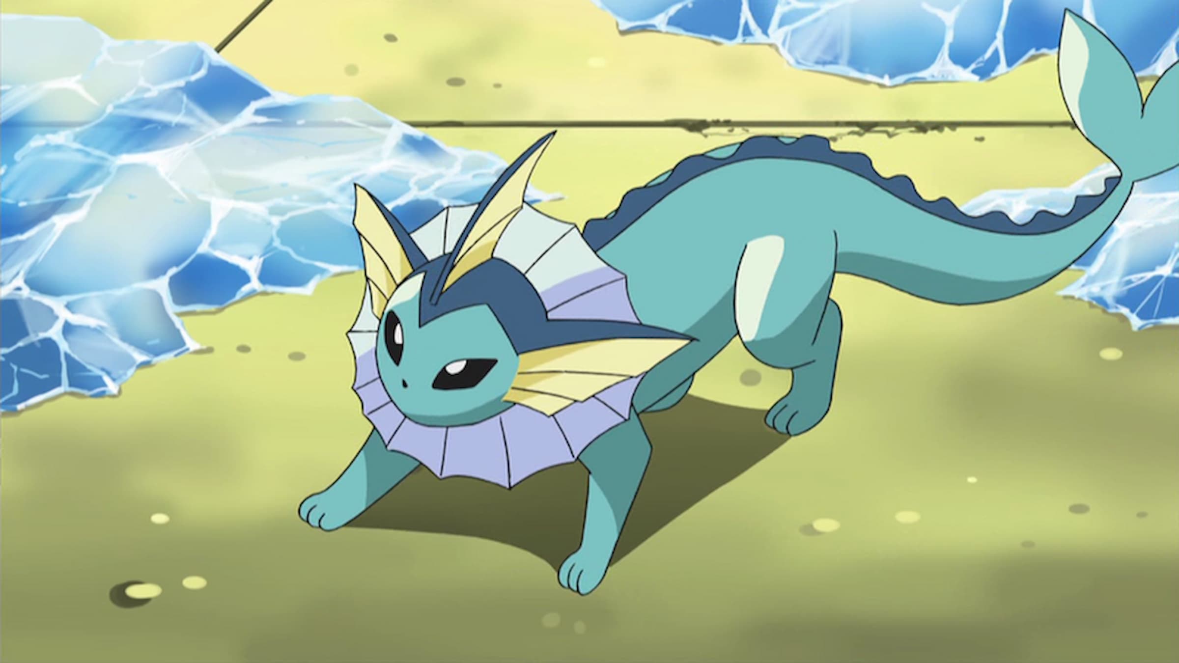
Vaporeon, first appearing in the original Pokemon Red and Blue games, is considered one of the most beautifully designed Water-type Pokemon. It looks like a graceful, swimming animal with fins and a streamlined tail. Its neck fin and long, mermaid-like tail clearly show it’s a Water-type, and the overall design suggests it moves smoothly and easily through the water – perfectly capturing the flowing nature of water itself.
Vaporeon’s design is notably simple and effective. Its smooth shapes and gentle colors evoke the feeling of peaceful water, and it avoids overly complicated details or weaponry. Instead, it expresses its Water-type nature through elegant, fish-like features. As one of the evolved forms of Eevee, Vaporeon has a strong and enduring appeal, consistently ranking among the most beloved Pokémon. Similar to Blastoise, it’s become a representative Pokémon of the Water type, and its popularity is supported by its strong in-game stats.
1)Worst Designed Water-Type Pokemon – Palafin
Palafin, a Pokémon first appearing in Scarlet and Violet, is designed around the idea of a dolphin that transforms into a superhero. While this gives Palafin a lot of character, it makes its Water-type design a bit confusing. Its normal form looks like a basic dolphin, very similar to Finizen, but the transformation creates a powerful, muscular hero. This heroic pose and exaggerated build feel more like a comic book character than a creature of the sea.
Fans have long requested a dolphin Pokémon, and Finizen initially seemed to fulfill that wish. However, its evolution into Palafin’s Hero Form is a disappointing change that ruins the Pokémon’s initial charm and detracts from its aquatic theme. If Game Freak had focused on the dolphin characteristics during the evolution, it could have been a fantastic Water-type line. Palafin’s Hero Form is easily one of the most underwhelming designs in Pokémon Scarlet and Violet, and it’s a particularly poor example of a Water-type Pokémon.
1) Best Designed Water-Type Pokemon – Kyogre

Kyogre, first appearing in the Pokemon Ruby and Sapphire games, is considered one of the best depictions of the ocean in the entire Pokemon series. This legendary Pokemon is designed like a huge whale, taking inspiration from the largest creatures in the sea. Its large fins and sleek body perfectly capture the impressive size and beauty of ocean life. Kyogre’s blue color and glowing red markings are reminiscent of the bioluminescence seen in deep-sea creatures, giving it an ancient and powerful appearance and representing many different types of watery habitats.
Honestly, what I love most about Kyogre’s design is how perfectly it feels connected to the ocean. Knowing it’s supposed to expand the seas really comes across in how it looks – it just radiates power! It genuinely feels like a creature born from the deepest, most mysterious parts of the ocean. And the fact that its Drizzle ability makes it rain when it comes out? That just seals the deal! Game Freak absolutely knocked it out of the park with Kyogre – it’s a perfect visual representation of a legendary Water-type Pokémon.
What do you think? Leave a comment below and join the conversation now in the ComicBook Forum!
Read More
- What Song Is In The New Supergirl Trailer (& What It Means For The DC Movie)
- Gold Rate Forecast
- One of Hulu’s Best New Shows Lands on Disney+ Ahead of Season 2
- Eurogamer Gives ARC Raiders 2/5 Over AI Voices, Dropping Metacritic Score from 94 to 84
- Ubisoft’s Best Game From the Last 5 Years Is Surprising
- This One Stranger Things Theory Explains a 9-Year-Old Season 1 Mystery, Sets Up the Finale, & is the Key to Future Spinoffs
- Netflix Just Surprise Added a Fantasy Movie Perfect for Jackie Chan Fans
- Invincible Season 4 Confirms a Major Atom Eve Change From the Comics
- The OG Resident Evil 1, 2 and 3 Are Now Available on Steam With a Heavy Discount (and DRM)
- Why Gideon Emerges as Resident Evil Requiem’s Most Compelling Character
2026-03-13 18:12