Image Comics has become known for publishing some of the most exciting science fiction, horror, and fantasy comics of recent years, giving creators a lot of freedom. They’ve had some big hits lately, like the first issue of D’Orc, and one of their standout series has been Lost Fantasy. This book cleverly blends fantasy with modern themes, offering a fresh take on the genre. Created by Curt Pires and Luca Casalanguida, Lost Fantasy built a fascinating world, and now Image is expanding on that idea. Fireborn #1 is the latest example of this, launching a shared universe storyline with Curt Pires teaming up with writer Franklin Jonas and artist Patrick Mulholland to continue the story within the world of Lost Fantasy.
Fireborn #1 is an enjoyable comic with both good and bad aspects. While it’s fun on the surface, there are a few issues with the overall story. Thankfully, these problems don’t ruin the experience, even if the first issue doesn’t quite hit all the right notes.
Rating: 3 out of 5
| Pros | Cons |
| The script gives readers an exciting story | The book does the annoying “start in media res” thing and then flashbacks to show the inciting events |
| Mulholland’s art is the MVP here, carrying the issue and giving readers some spectacular action scenes | Some of the action scenes have way too much going on and it’s hard to always find the focus |
Fireborn #1’s Writing Is Its Weakest Part
The first issue of this story aims to introduce the main characters, supporting cast, and the villain, while also establishing some of the backstory. While it touches on all these elements, it doesn’t do so effectively. Despite being longer than usual, I struggled to connect with any of the characters. Even the explanations about the main character and his family felt incomplete. I could guess at the roles of some of the other characters, but many seem like minor players who won’t reappear later in the story.
As a long-time movie and comic book fan, I have to say this story started with one of those frustrating openings that throws you right into the action without any setup. It just didn’t grab me, and honestly, I prefer a more traditional approach where you get to know the characters and understand why things are happening. While the action sequences were definitely cool and kept things moving, I think the issue would have been much stronger if it had spent more time developing the characters and the overall plot instead of relying so heavily on big fights. It felt like style over substance, and I was left wanting a bit more depth.
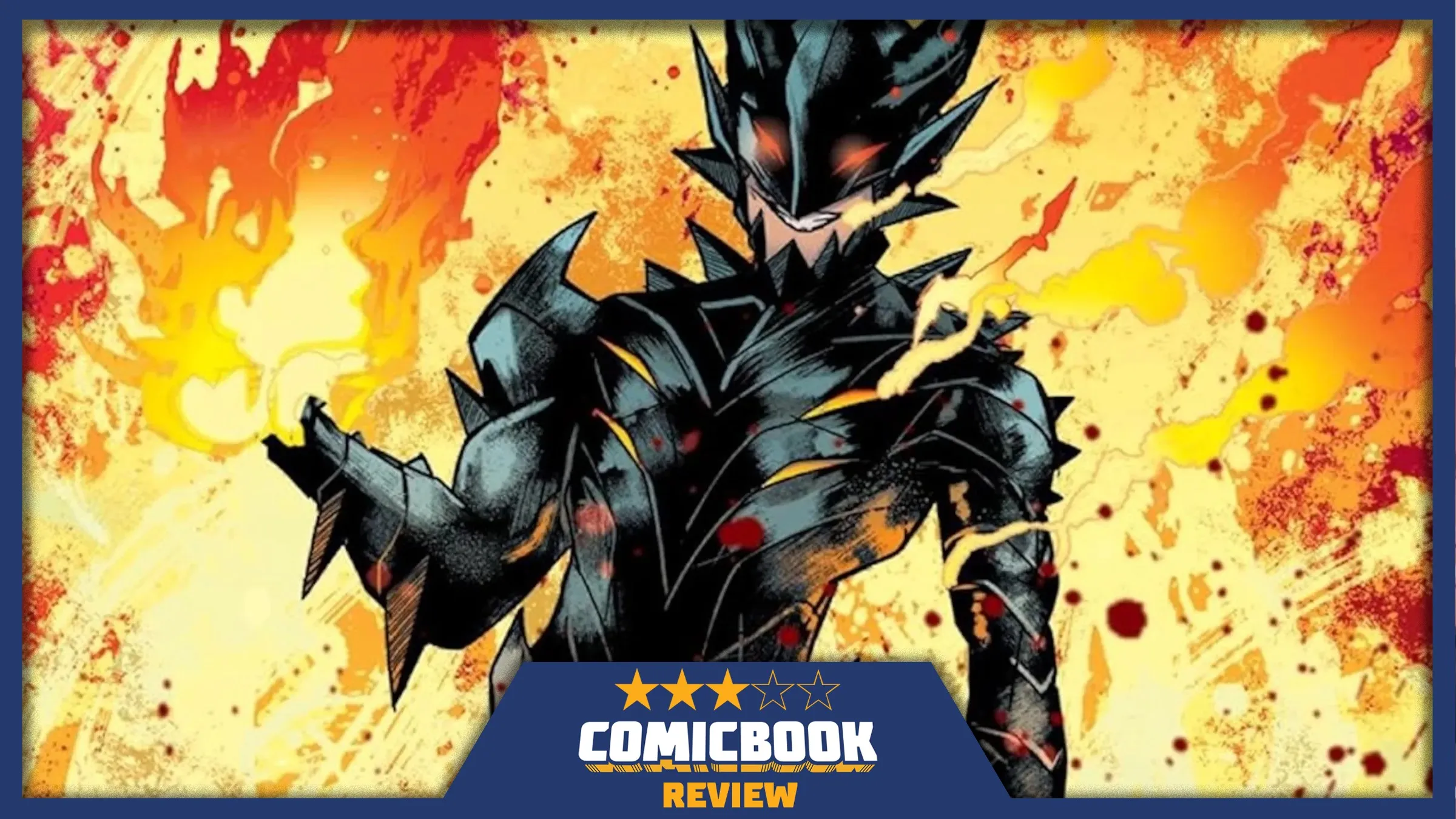
Mulholland’s Art Carries This First Issue
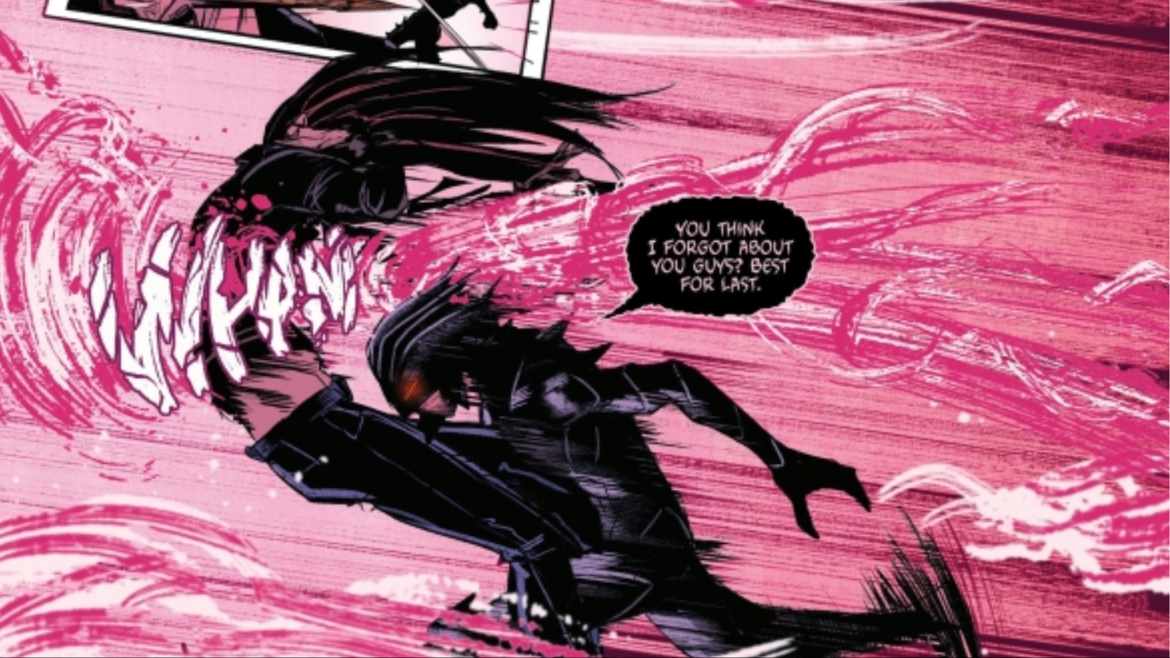
I was completely hooked by the art in Fireborn #1! The story really moves with a ton of exciting action, and Patrick Mulholland’s artwork is fantastic. Every panel looks amazing – the characters are really expressive, and there’s a great level of detail. I also loved how the pages were laid out; the pacing felt perfect. While his style does remind me of some manga and anime artists I enjoy, Mulholland and colorist Mark Dale truly make it their own, and it works beautifully.
Dale’s artwork is crucial to the comic’s look and feel. He does a great job creating impactful energy effects that appear realistic. However, these effects appear on nearly every page – often as bright pink backgrounds – and can become distracting. Despite some minor annoyances, the art is visually stunning and helps to elevate the story, compensating for some of the weaker writing.
Fireborn #1 is an enjoyable comic, but it doesn’t quite stand out as a strong debut issue. Image Comics publishes many excellent fantasy titles, and this one has potential, but this particular issue doesn’t fully deliver. I actually forgot the main character’s name, which is a concern. While the action is cool and the artwork is consistently good, overall it’s just an average read.
Fireborn #1 is on sale now.
https://comicbook.com/comics/news/10-best-image-comics-series-of-all-time-ranked/embed/#
Read More
- Elon Musk’s Mom Maye Musk Shares Her Parenting Philosophy
- GBP CNY PREDICTION
- Mark Zuckerberg & Wife Priscilla Chan Make Surprise Debut at Met Gala
- Forza Horizon 6 Car List So Far: Confirmed Highlights, Cover Cars, DLC, and Rewards
- 10 Greatest Manga Endings of All Time
- Elon Musk’s Ex Ashley St. Clair Reveals When Romance Became “Weird”
- 38 Years Later, Murder, She Wrote’s Most Overlooked Episode Still Pulls Off TV’s Greatest Crossover
- 10 Best Free Games on Steam in 2026, Ranked
- Hollow Knight: Silksong Guide – All 30 Lost Flea Locations
- 20 K-Dramas That Nailed the Perfect Ending
2026-04-15 17:42